By now you may have seen the Halo Championship Series logo. If not, then look right below.
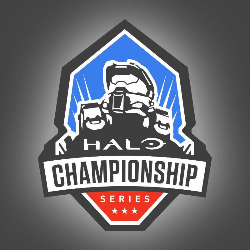
This is a great logo, however, the colors are way too muted form something that represents an eSports league.
So, I decided to punch up the colors. That grey was made full black, while the red and blue had some added richness of color.
![]()
Now that looks better, IMO. However, I took it yet another step up and gave Master Chief and the word ‘HALO’ some additional color.
![]()
Personally, I like it this way. Just seems more LIVELY! I’d love to have a patch like this!!
-Sal
Wow Sal! You really make that logo pop!
Thanks. I’d love to have a t-shirt with this on it….Oh Halo Waypoint store???
Great job! Does 343 know about this? It really does look like a patch with that outline around the logo. I do think it might look a little better if you could somehow make it more distinguishable between the black background and the black border around the logo but it doesn’t really matter as it looks fantastic nonetheless!
Meh, the black border was just how the file was dropped into the article. It doesn’t have that entire background. It’s a .gif file without a background. Unfortunately, wordpress added in the background.