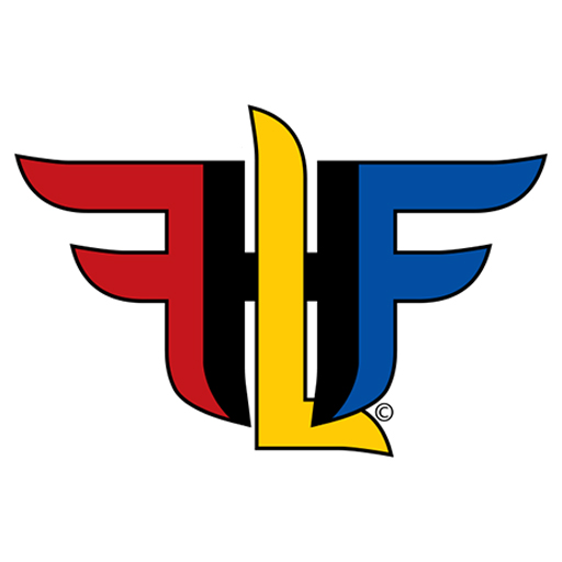
As you can see, HFFL has some fresh new graphics!
I had been toying with the idea of a new logo for some time now, The look of the final logo is something on the order of what I had initially designed. The initial design was nowhere near as stylized as this. It was very blocky but still maintained the reverse F, H, L in the middle and F.

However, as seen above, I wanted some more flare. This design was one of about two dozen I came up with. In fact, this particular version is the 11th or 12th iteration of that design.
The colors have a couple of meanings. Red and blue for traditional Halo team colors. Black and GOLD (not yellow…) for my hometown of Pittsburgh’s sports teams. So in this way it says both Halo and Pittsburgh at the same time.
I felt that after 13 years, it was time for a change. I wanted colors that felt more in line with Halo and where I’m from. This also meant I needed a new Header image. The one I had previously was definitely outdated. I needed to update my Spartan to the one I use in Halo Infinite. Likewise, new text, the logo, colors and such needed added to the banner to put in on brand with the new look.

The background image certainly needed a refresh. I chose to go with the Weapon and Chief as they are the integral characters to Halo Infinite. You may or may not see the background depending on your device used to see my site or your settings.
Here’s the background. Yes, I know the Twitter and Instagram links are shown again, as they are in the header image. The header moves as you scroll, while the background is in static position. That is why I chose to include those social links in both images.

I hope you like the changes! Do not steal any of the site’s images, including the logo, header and background, These are my branding and NO permission is given. If you want to link to my site or this article specifically, that is okay. But again, no copying or altering my images for use elsewhere. That’s a no-go.
