Modded Halo 3 Covie vs Covie battles!

Gamecheat13 made this vid of various Covenant vs other Covenant. Stay through the whole vid to see the fun BONUS rounds!

Normally I’m not much of a proponent for modded stuff. This though is FUN!
I wish we, the average gamer, had the ability to do this.

You can find this and more at Gamecheat13’s YouTube channel HERE.

-Sal

Halo Concept Art: Halo 4 Equipment

I had meant to post this on Friday. However, with the exciting news of Halo 5 Guardians, I devoted that whole day to just that topic in a myriad of articles, podcast, etc.

Yesterday I was quite busy, so other than the theory of Halo 5 Guardians, I didn’t have time to get this posted then.

However, here I sit at nearly 3am EST, Sunday. I’m wide awake and ready to go. Now I had said the next concept article would be Halo 4 Equipment and Other Spartan Armor. With there being 24 pics for just the equipment, I decided to split them up.

So without further ado, let’s look at and discuss Halo 4’s concept art of equipment.

halo_4_actives_shield_final_by_kory_lynn_hubbell
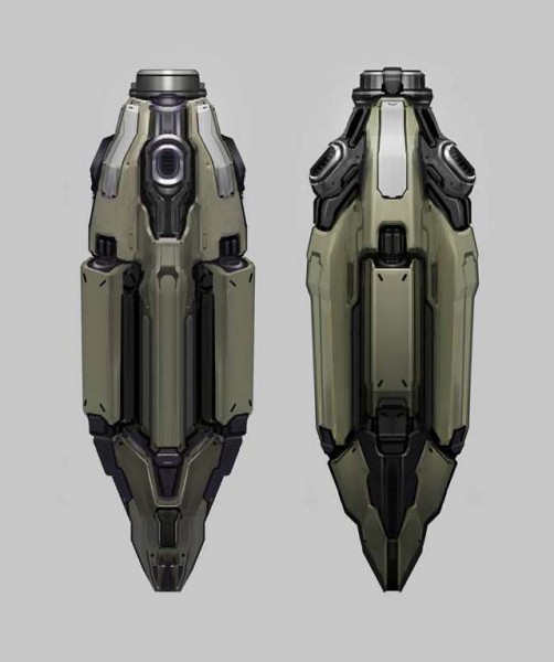
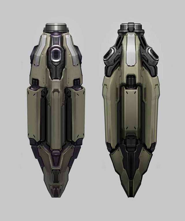
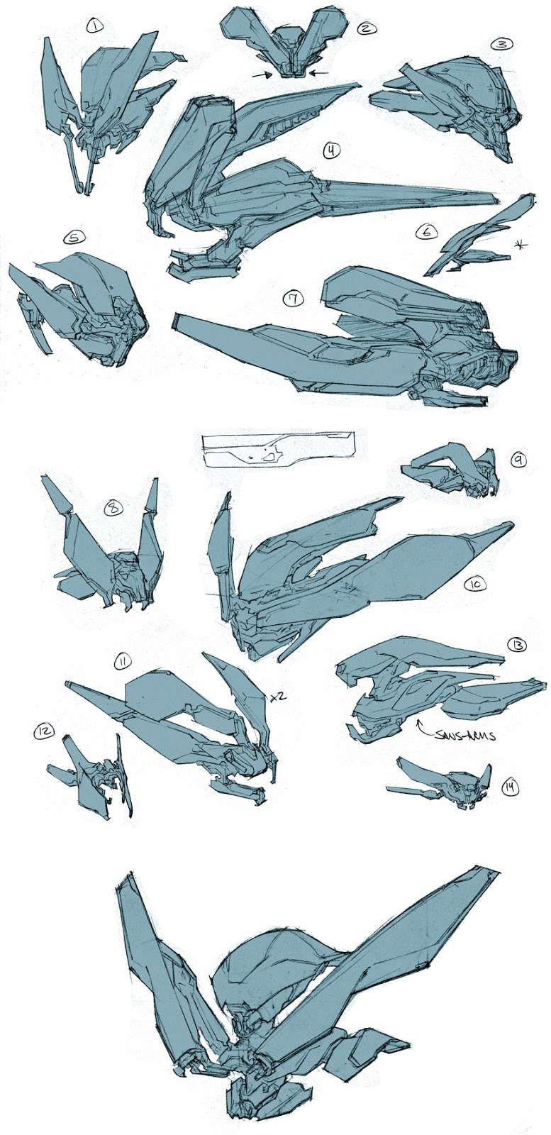
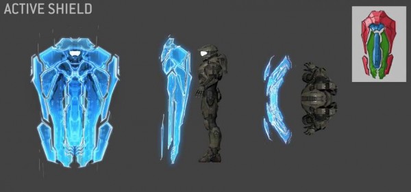
The Hard Light Shield. Hard Light itself is not new to Halo. We’ve seen it from the beginning with jackal shields,light bridges and such. This design brings us the Forerunner equivalent to the Jackals shield. Though, I’d say it’s likely better. What I like about this concept is that it most definitely evokes Forerunner design. The upper right conner rendering seems to convey different layers of the shield. The orthogonal views real help in understanding the shape and size of the Hard Light Shield. Good piece of art here.

halo_4_belt_bomb_01_by_paul_richards
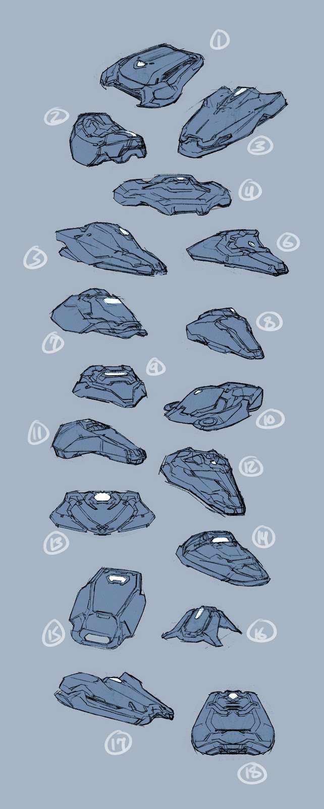
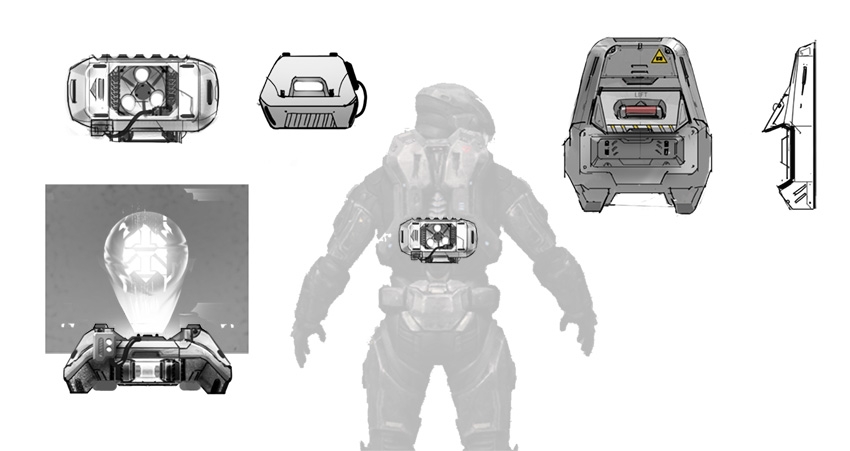
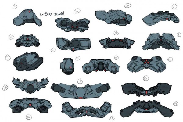
While this graphic is called “belt bomb” we know that they are really the ability upgrades. In just three colors for each, we get a good sense of depth. I like some of these designs more than others.Notably 2, 8, 11, 13, and 16. The one that stands out the most to me though is 12. Does it or does it not look like a controller?

halo_4_concept_art_by_thomas_scholes_23b
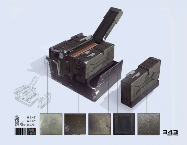
Next we have this ammo crate. This is a very detailed concept. I appreciate the dimensions being put in as well. The texture sample boxes show just how much can go into something as simple as an ammo crate. Did you know there is a version of this up for sale soon? Check it out HERE!

halo_4_concept_art_by_thomas_scholes_24b
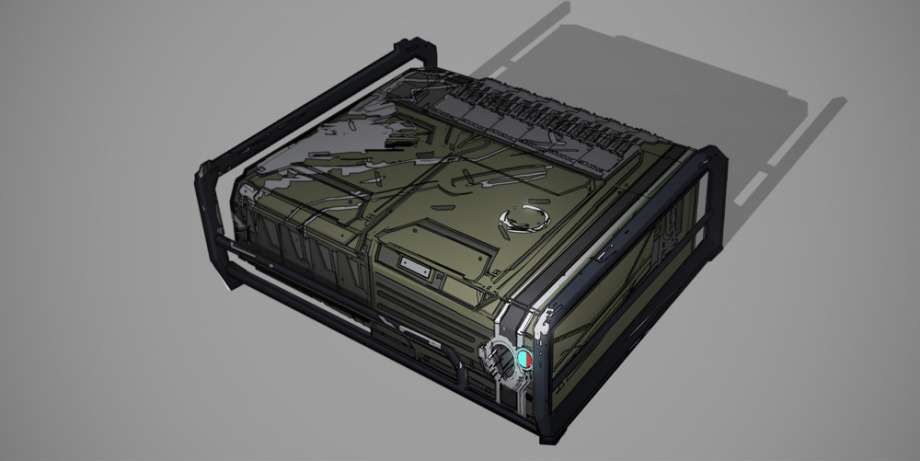
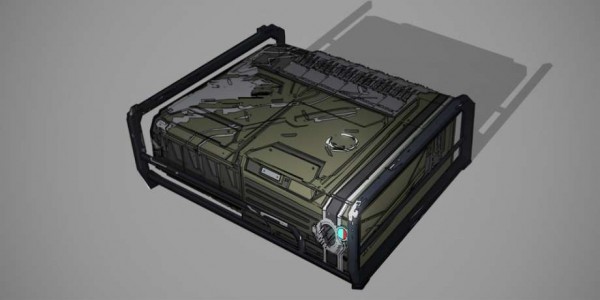
This piece of art looks strangely like an XBOX 360. Coincidence? LOL The scratched metal adds character to what would have otherwise been a standard green box. Even for a sketch, there is a good amount of detail in here. I’d have loved to have seen this become a Halo 4 XBOX!

halo_4_fr_fusioncoil_final_small_by_kory_lynn_hubbellWe’ve been used to fusion coils in Halo. Now we get to see an amazing design for the Forerunner fusion coil. Both the highlights and shading give the renderings plenty of depth. For me, my eye immediately goes to the blue light though and it’s glow against the coil itself. Excellent design!

halo_4_ordnance_drop_pod_by_josh_kao

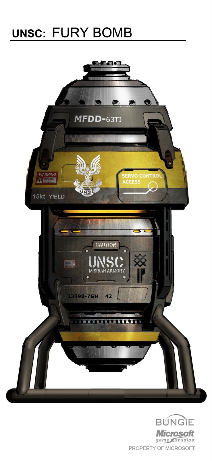
Another thing we’ve seen in Halo are ordnance crates. Don’t forget the tube shaped ones in Halo 3 for example. Here we have an ordnance pod that looks designed to mean business!  Basic shapes in this concept coupled with a muted color scheme actually work very well for this piece. It’s a utility device. So as such, does not need to be fancy. This is a well thought out concept.

halo_4_pickup_projector_02b_by_paul_richards
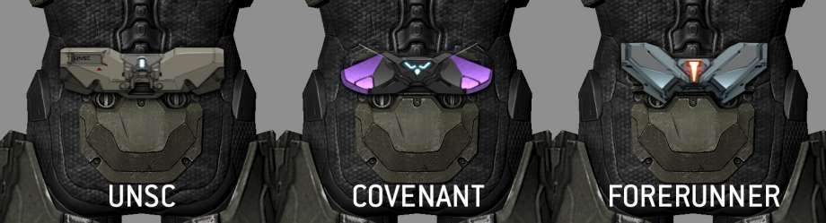
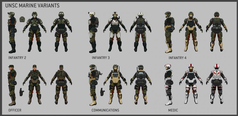
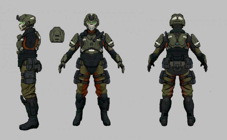
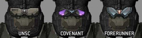
Here are three more fleshed out armor ability attachments. Visually it was important for 343 to be able to differentiate all three styles. Clearly UNSC had to be green/grey, Covenant Purple, and then there the Forerunner attachments. With the Didact’s armor having a lot of silver with orange lights, it made sense to bring that feel to the attachments as well.

halo_4_tortoise_console_by_kory_lynn_hubbell
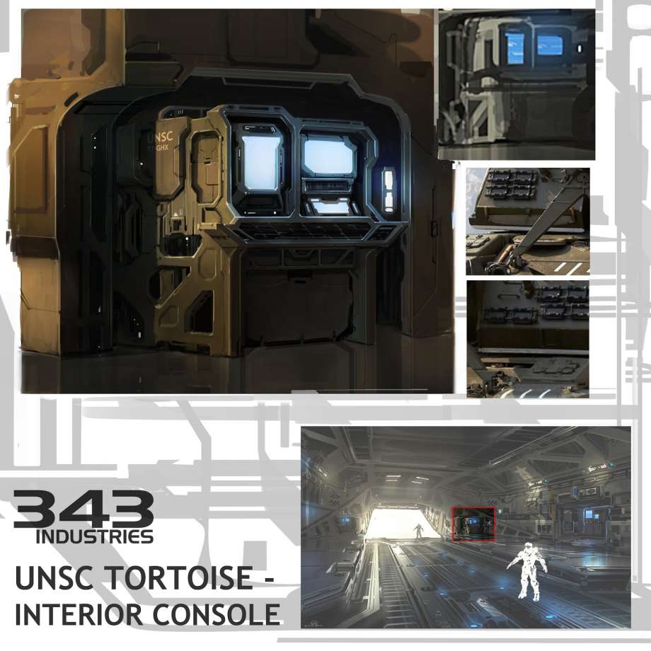
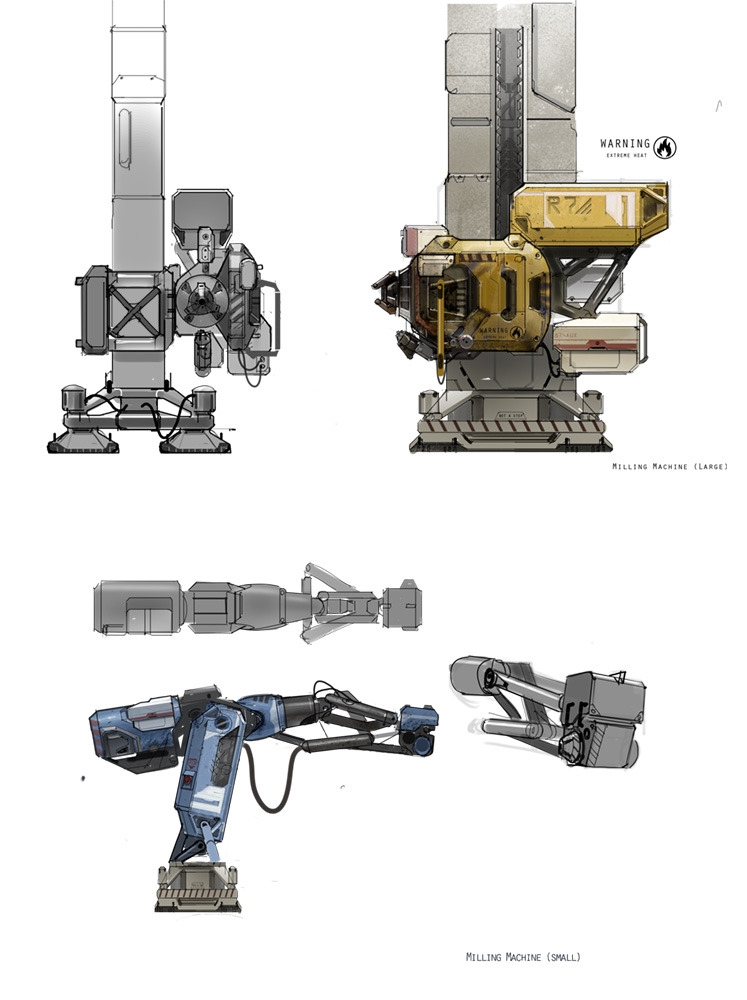
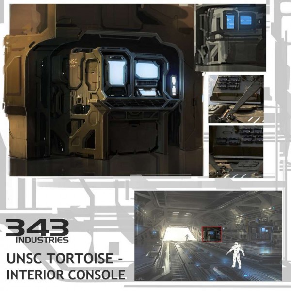
Funny enough, by looking at this piece we see the Mammoth may have been named the Tortoise instead. (I much prefer Mammoth) The consoles within took a little bit of a different shape in the final in-game version. This concept shows well the early concept stage (upper right), more fleshed out designs, and even placement as see at bottom. Note the main pic within has the console being very detailed, while the outer parts are rougher in rendering. This is a good way to direct the viewers eye to specifically where you want them to look.

halo_4_tortoise-ammorack_concepts_by_kory_lynn_hubbell
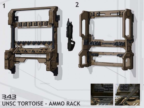
Even the ammo rack had to be designed. Once again, it’s fairly simple in shape and color. The accouterments of the rack are what gives it its detail. Without, this could have been a multitude of things.

halo_4_unsc_communication_tower_by_josh_kao
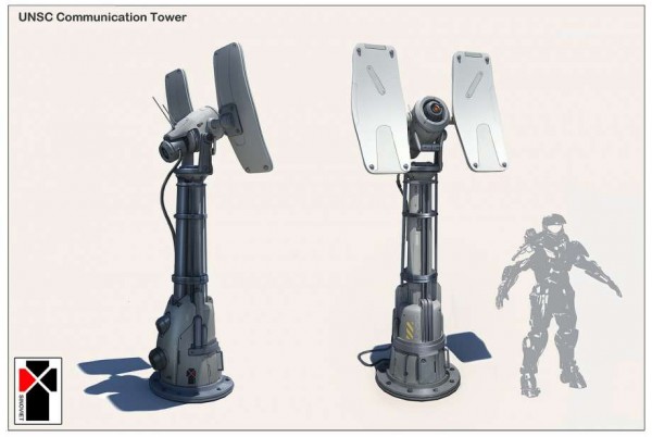
Did you see these in the game? If not, go check out Spartan Ops Episode 5, Chapter 1 (Spartan Miller). There, your task in part will be to activate and defend these towers. It seems 343 really wanted to show detail in their concepts for equipment. Even with it being mostly shades of cool greys, there is plenty enough detail to convey what this is supposed to be. BTW, if you haven’t ever played or have not played in a long time, Spartan Ops, I suggest going back and doing so. It’s a nice break from matchmaking. The whole 50 missions are like a whole other campaign unto themselves. And if you still need Covenant vehicle kills for Commendations, you can EASILY get them there!

halo_4_unsc_displays_by_albert_ng
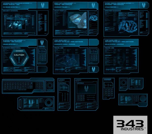
This compilation of displays once again goes to show us the amount of detail 343 put into Halo 4. These displays are in many places within both the Campaign and Spartan Ops. A couple of display (not shown here) on the Campaign mission “Composer” are fantastic. They are located in the two-story room just before you have to bring up the shield to stop the Covenant from getting into the hangar bay. Search them out. It’s worth it, IMO!

halo_4_unsc_drop_pod_by_josh_kao
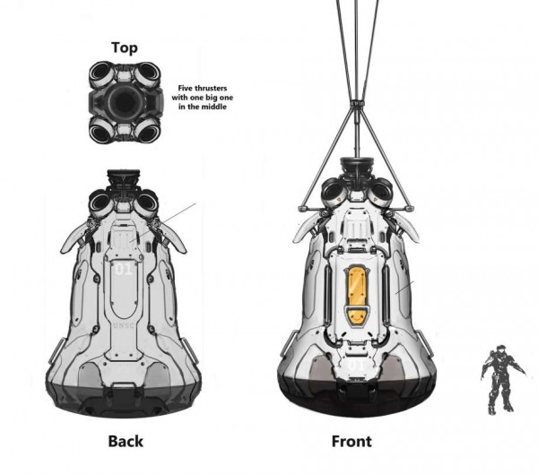
Now these I do not at all recall in the game. What they do look like though are the capsules form the 1960s rockets, when they crash landed in the sea after the missions were complete. While a nice throw-back, I’m glad this wasn’t put in, as we’ve already had much more advanced drop pods in Halo. (Halo 3: ODST anyone?)

halo_4_unsc_forerunner_knight_projection_by_albert_ng
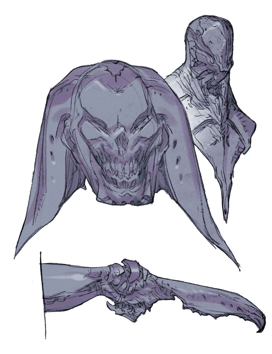
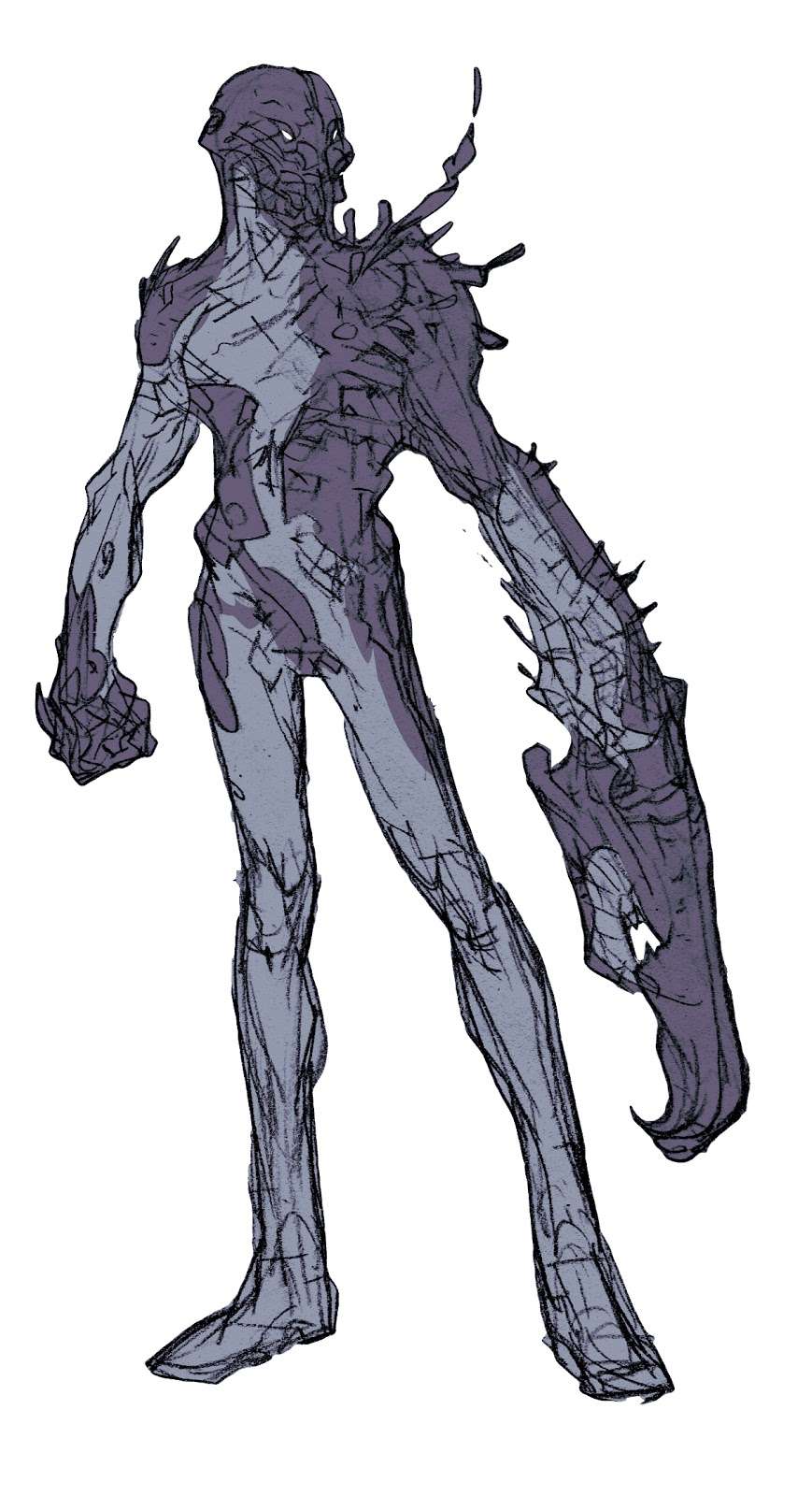
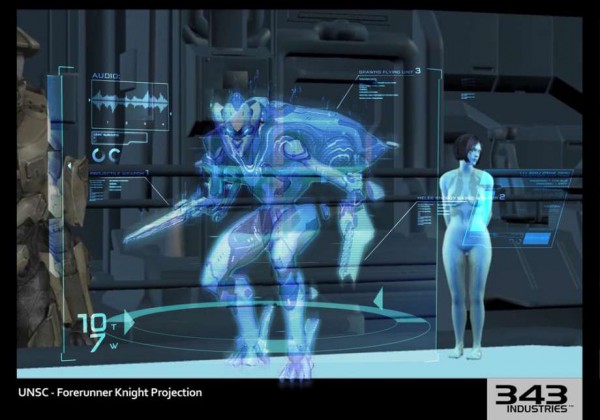
A digital concept showing a Promethean Knight on a Holotable. I do hope one day soon holographic technology like this will be real. We’re CLOSE!

halo_4_unsc_fuel_pump_by_albert_ng
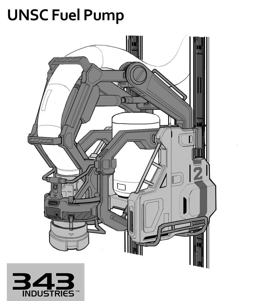
I’m not sure where this pump is in the game, though I want to say the multiplayer map Complex. (If I’m wrong, please let me know where this can be found in-game.) As for the art, it’s very simple. In that though, it’s CLEAN. No real stray lines to detract you from the design. With varying shades of grey, we again get the sense of shape and depth to the art, without it having to be full color.

halo_4_unsc_hanger_platform_by_albert_ng
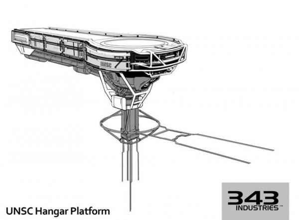
Remember that Hangar Bay I mentioned earlier? Well, this is the section where you have to run to to bring up the shields. At the end, there is a column (not shown) by which to bring up the shields. This design brings me back to Star Wars The Empire Strikes Back. Specifically within Cloud City, during the lightsaber fight between Darth Vader and Luke. Yes, that’s an old reference…But I just LOVE those movies!

halo_4_unsc_missile_battery_by_albert_ng
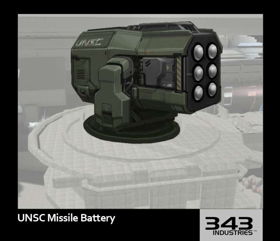
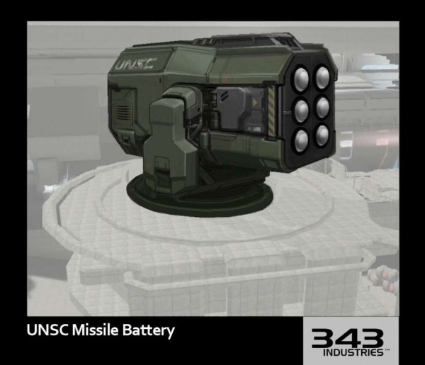
Now this is most definitely on Complex, during certain Spartan Ops missions. Good color application brings this to life. The bulkiness of the missile battery give it a sense of power, however, it’s likely they are short range.

halo_4_unsc_powercore_by_kory_lynn_hubbell
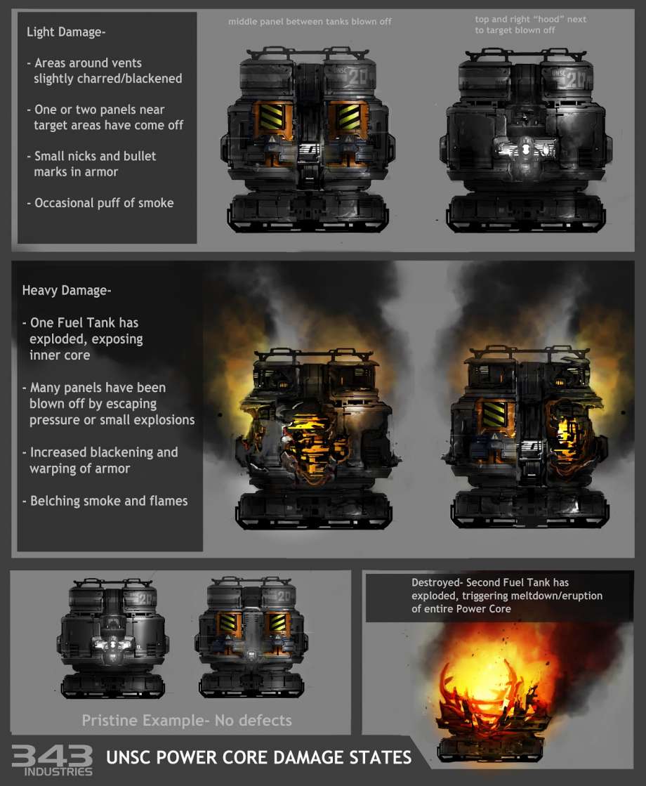
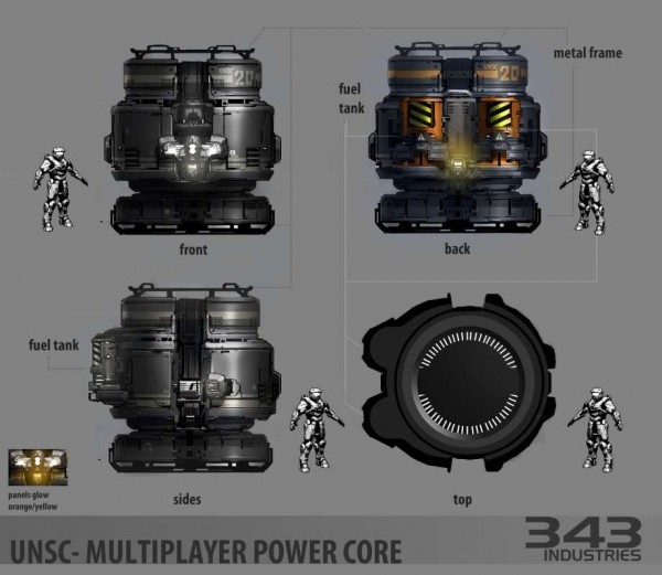
Another example of something that can be found in Spartan Ops. In one of the Cauldron missions, you have to protect the marines as well as these power cores. There are only two of them. It’s a fun mission and pretty tough if you go it alone on legendary. I used this mission to get my assassinations of Covies commendation done. Regarding the art, I’m glad that the color version was put in. The other three look a little flat. Yes, there is some shading, but most of it is very dark. Once again, color really helps to show off detail and depth.

halo_4_unsc_powercore-damagestates_nostamp_by_kory_lynn_hubbell
Here’s the follow up that shows the progressive damage the power cores take. Here is where this concept really blows up! Yes, pun intended… The callouts (text around the design) explain the damage well. Good piece of transitional art.

halo_4_unsc_projector01_by_paul_richards
The name of this is a UNSC projector. I’m not quite sure what this means or where it might be in the game. I can only think maybe the holotable or the hologram projection armor ability. Sketches like this represent a brainstorming session. It’s where you have no definitive design choice and just come up with as many different designs as you can quickly. This helps as the people involved, especially those in the decision making, have more things to look at. They may like a piece of one, a part of another, and so on. I’ve done many of these types of things over the years. It’s a very good method to use.halo_4_unsc_props01_by_paul_richards
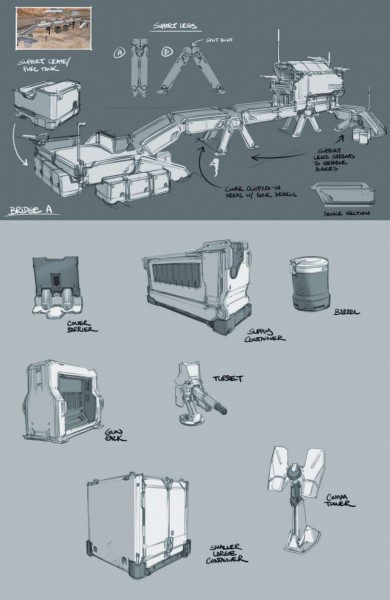
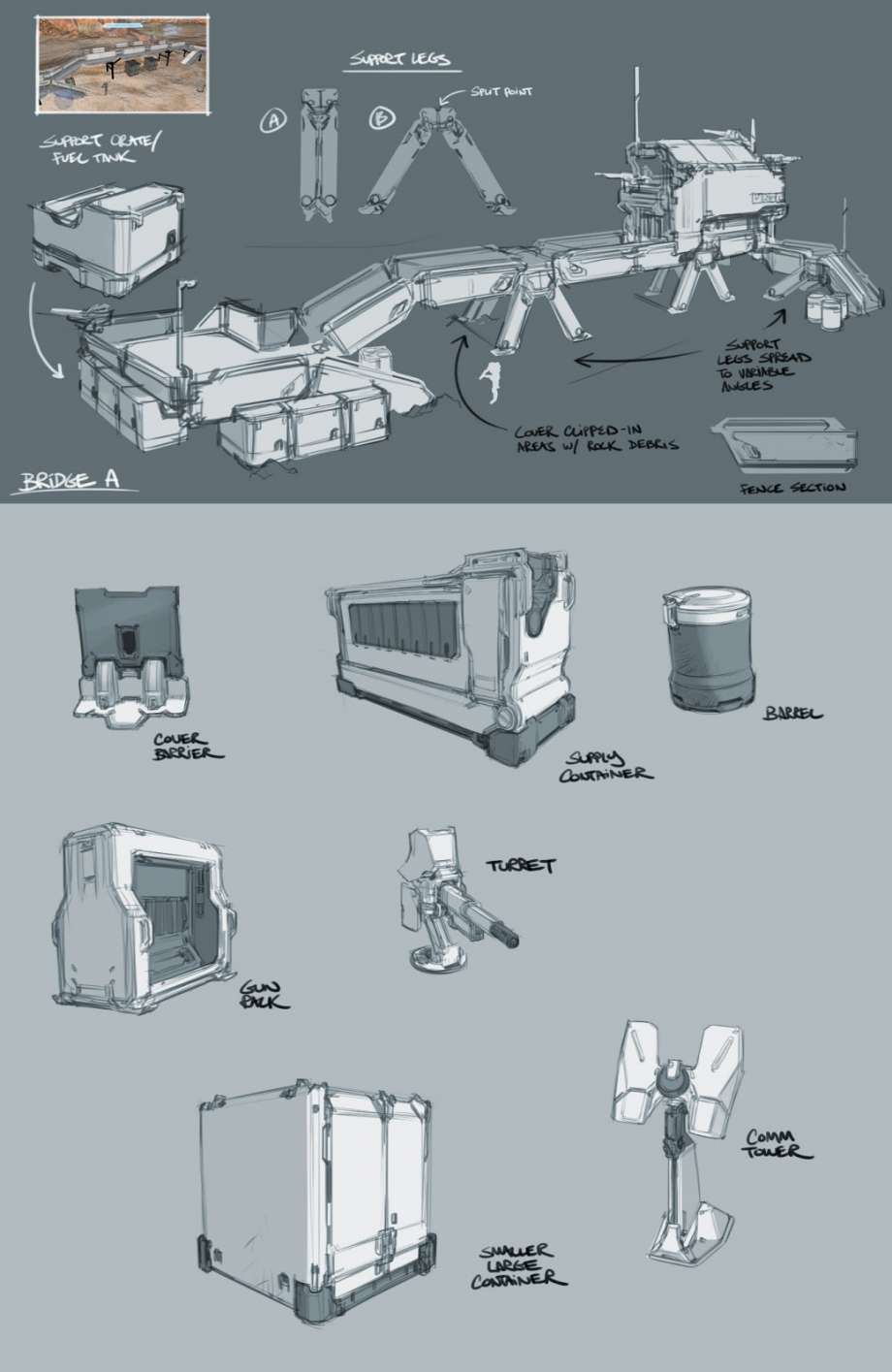
In the above top, we see a modular temporary base. You can tell it’s modular by the design. It’s something that’s meant to be put up quickly, and/or shuffled around to meet the requirements of the mission. The in-game version can be seen in Spartan Ops. While just grey in color, the line work is enough in the sketch to make out the shapes. Sometimes your line art can stand up to a more colorful design, so long as they are drawn well and not sloppy. This is an example of a well done piece of line art,with a bit of grey added in.

halo_4_unsc_science_lab_large_door_by_albert_ng_01
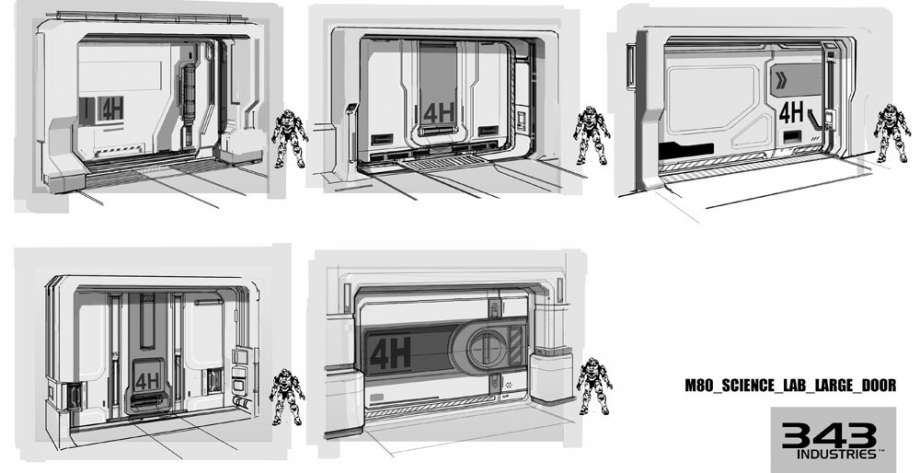
Not quite equipment, but this is the section the above fit into the best. It’s amazing how something as simple as a door can have many compacts of it.All of them are quite good. I think the bottom oat right is my favorite of these. Which one is your favorite of them?

halo_4_unsc_space_station_props_by_albert_ng
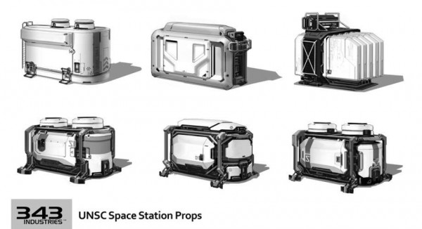
More props to fill in a room. It’s these kinds of extras that make a place look more real. Without, you’d have a mostly empty space. The variances as well as similarities tells us that while they may have different uses, they are all of the same design manufacturer.

halo_4_unsc_touch_table_by_albert_ng
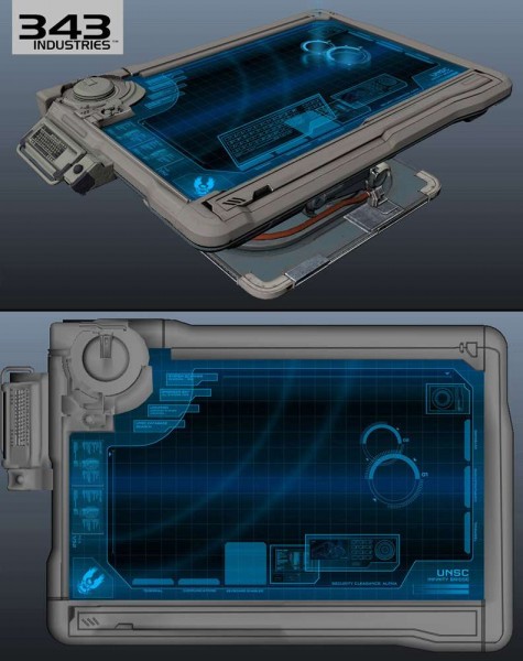
And finally, the Holotable. I saved this one for last as I like it the most of all of these in this article. We’ve seen on tv something similar. I think it was CSI: Miami that had one. Though that wasn’t a holotable. It was more of a glorified tablet in table size. This can be seen in both the campaign and Spartan Ops. Sarah Palmer actually damages it in a later episode. Go check it out.

Whew, okay, it took me almost an hour and a half to get this article done. Mostly because I’m feeling a little ill this morning. I found a round steak in our freezer and thawed it to be grilled for dinner. After grilling it and my wife and I ate it, she wanted to know where it came from. I told her…. I shouldn’t have got that steak. Turns out it was one forgotten and was literally 4 YEARS old. Yes, frozen that whole time…But I think that’s why I’m sick this morning…yuck. (It did taste good though).

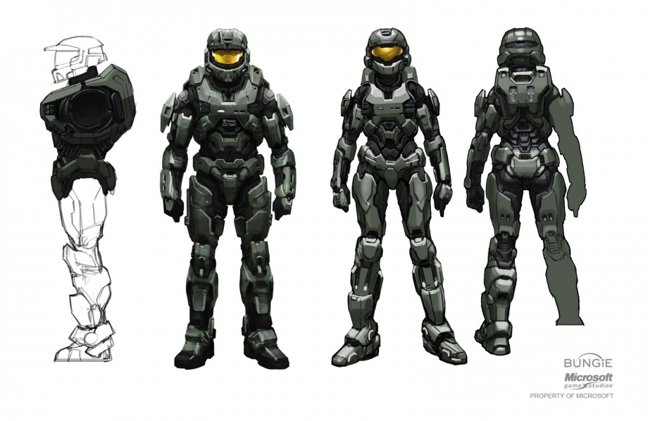
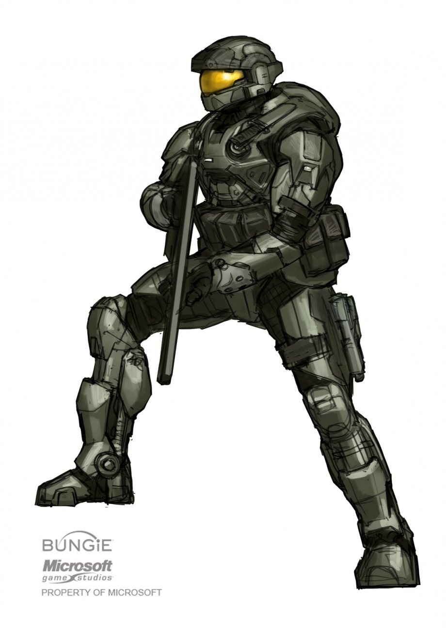
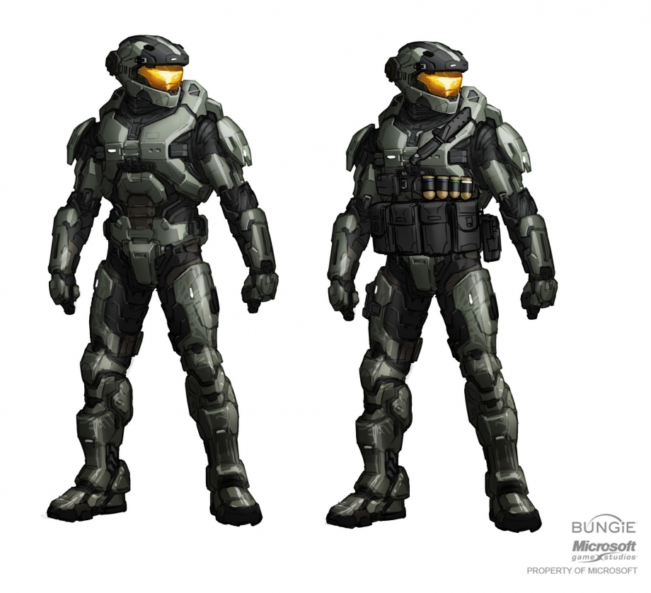
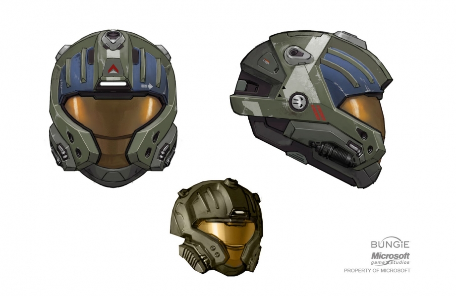
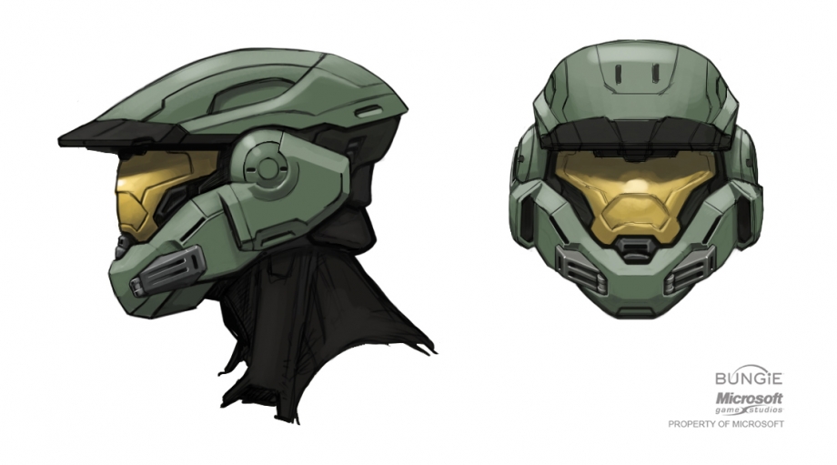
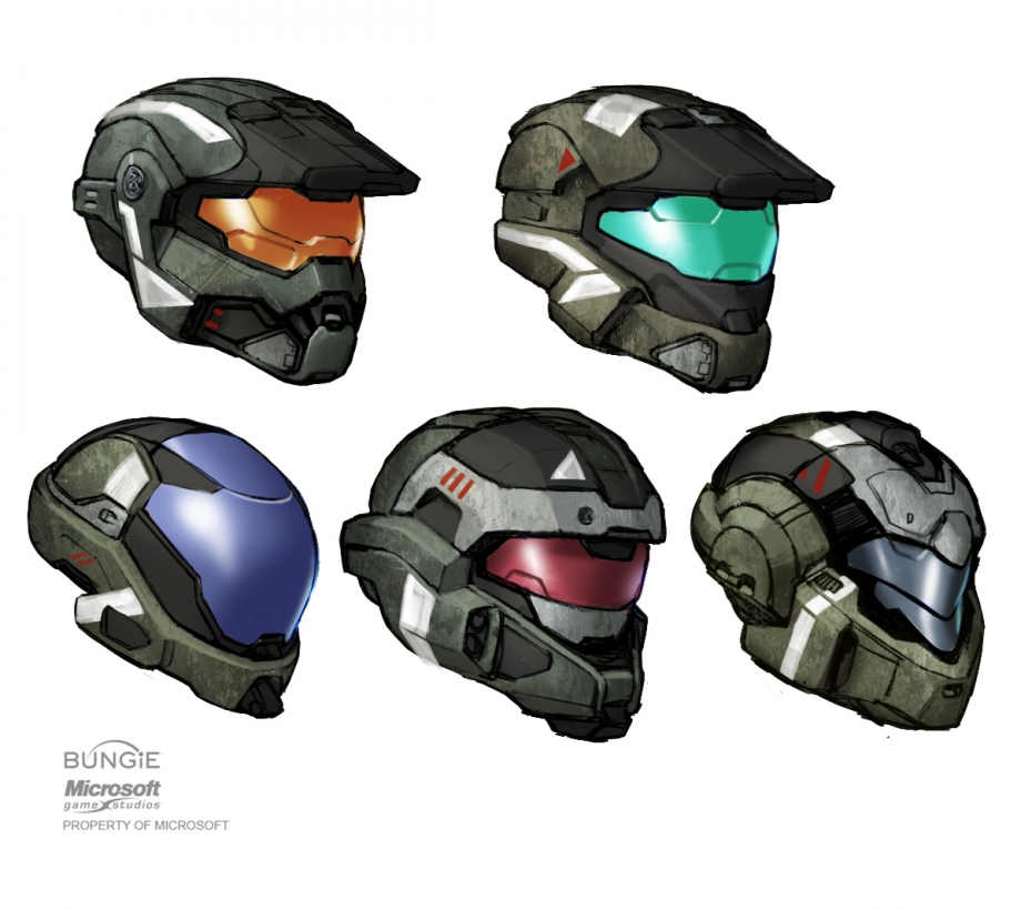
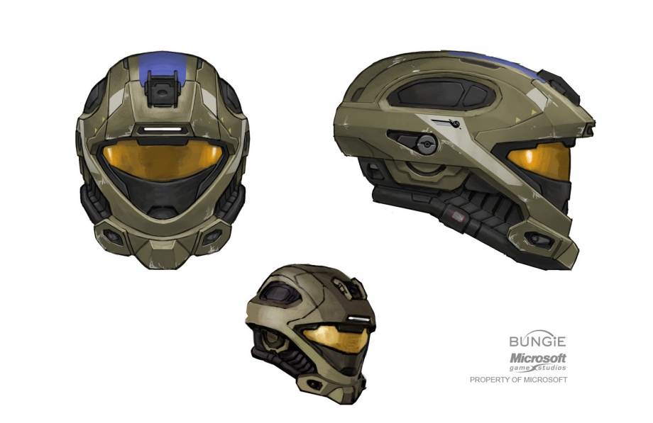
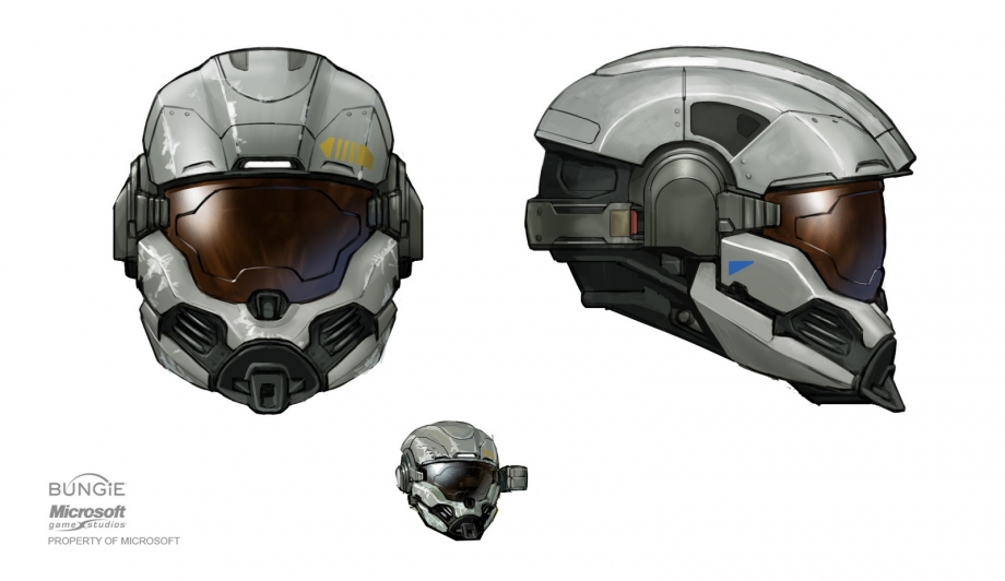
Later today, I’ll have up the other concept art article on “Other Spartan Armor” of Halo 4. And who knows what else might just pop up.

I hope you’ve enjoyed reading the article and looking at the concept art. Let me know if so by replying below. (Rhyming not intended…)

-Sal

Halo Concept Art: Reach Equipment and Characters

Today we take a peek at some equipment and spartan armor of Halo Reach.

haloreach_equipment_civilian_milling_machines_by_ryan_demitaAbove we see some machinery. You can find the mechanical arm at the bottom, on the last level of the campaign. It’s within the final room just before you climb the ladder to use the MAC canon.

haloreach_equipment_unsc_weapons_explosives_fury_bomb_by_isaac_hannaford
I can really appreciate this piece. The shading is superb and the metallic sheen is near perfect for a piece of concept art.

haloreach_equipment_unsc_armor_mjolnir_parts_powerup_mountVarious equipment packs. If I recall, the one near top right is the M-spec reentry pack.

haloreach_equipment_unsc_armor_mjolnir_full_customization_concepts_by_isaac_hannafordVarious armor sets. The red color of the armor shows some of the differentiation and multiple configurations the Spartan IIIs can have.

haloreach_equipment_unsc_armor_mjolnir_full_markiv_by_isaac_hannaford

A concept showing both the male and female default armor of Noble 6.

haloreach_equipment_unsc_armor_mjolnir_full_spartan_portrait_01_by_isaac_hannafordAnother armor concept. This one makes me think ODST meets Spartan.

haloreach_equipment_unsc_armor_mjolnir_full_spartan_portrait_02_by_isaac_hannafordDefault Noble 6? Some additions.

Often as is shown by the red armor pic and the one immediately above, base models are used which then have layers added to them to create a different effect.

The following are 9 graphics of Spartan helmet concepts.

haloreach_equipment_unsc_armor_mjolnir_helmet_cqb_helmet_by_isaac_hannafordThe CQB helmet of Reach. While this color version didn’t make it in the game, I’m very happy that the helmet itself did.

haloreach_equipment_unsc_armor_mjolnir_helmet_eod_helmet_01_by_isaac_hannafordhaloreach_equipment_unsc_armor_mjolnir_helmet_eod_helmet_02_by_isaac_hannaford.jpghaloreach_equipment_unsc_armor_mjolnir_helmet_eod_helmet_03_by_isaac_hannaford.jpgThe above three show subtle differences in the EOD helmet, most notably the visor.

Any one of those would have been great for the design in-game.

haloreach_equipment_unsc_armor_mjolnir_helmet_gungir_helmet_by_isaac_hannafordHere we have the Gungnir helmet. This is the first Spartan Helmet to feature a near visor-less visage. But for the small eyehole, there is no apparent way by which the Spartan can see out. It’s presumed the helmet has a view screen within that shows the Spartan their surroundings. The design is very cool. Something even more advanced than what we’re used to for Spartans. I am glad however the Bungie stopped at this one and didn’t create anymore without visors. 

haloreach_equipment_unsc_armor_mjolnir_helmet_helmet_by_isaac_hannafordThis looks to be the final concept of the Mark V [b] helmet. here in green, ultimately as we know the default became steel in color. I love the clean lines of this design. It looks completely plausible as a helmet, even in rendered form.

haloreach_equipment_unsc_armor_mjolnir_helmet_helmets_by_isaac_hannafordYou may have likely seen this image before. While some of these designs, didn’t make it into the game, it appears 343 borrowed a couple for Halo 4. The bottom left and bottom right looks similar in concept to the Orbital and Venator helmets, respectively.

haloreach_equipment_unsc_armor_mjolnir_helmet_recon_helmet_by_isaac_hannafordHere the Recon helmet has had a slight redesign from previous game. I like this version a lot. For some reason, that bottom one reminds me of a snake. I can’t quite put my finger on why though.

haloreach_equipment_unsc_armor_mjolnir_helmet_skull_helmet_by_isaac_hannafordAnd finally for this article, we have the HAZOP helmet. HAZOP meaning, hazardous operations. Most people refer to it as the skull helmet though. This was one of my favorite helmet designs of Reach. Now if this had also been combined with the actual skull helmet, it would have been beyond cool.

Once again, this is a little late. Heh, I have to blame my wife on this one…She started playing the Avengers movie right next to me. That made writing this extremely long as I couldn’t help but watch most of the movie as it played. LOL.

Tomorrow we look at some of the Halo 4 counterparts to these concepts.

What was your favorite helmet in Reach and why? Let me know by replying below!

-Sal

Revised Halo Starship comparison poster!

Hot on the heels of this week’s bulletin, I’ve added the Vindication, Poseidon, and Strident class ships to the poster. Click to make poster a lot bigger!!!

StarShip comp 5-14-14_smPlease feel free to download the graphic. If you share it elsewhere, please let people know where you got the graphic from. Post “By Sal Salerno of HaloFanForLife.com” and/or the link back to this article: https://halofanforlife.com/?p=14264 Much appreciated!

-Sal


Halo Concept Art: Halo 4 UNSC, Cortana and Master Chief

Each of these articles I’ve endeavored to show you something new. Today might buck that trend, depending on what you’e seen before. Many of these were part of the advertising campaign for Halo 4. Still, I hope you enjoy them. As always, if you ant to see them bigger, click on the pic!

First up personnel of the UNSC.

halo_4_scientistmale_final_sheet_by_kory_lynn_hubbellThis is one of the official orthogonal views from Halo 4.This would have been a typical male scientist aboard the UNSC Infinity. We didn’t quite see this version. Though it’s pretty safe to assume it evolved into Dr. Glassman as well as the several unhooded scientists seen in Spartan Ops.

halo_4_scientistmale_variant_2_by_kory_lynn_hubbellAnd here’s the hooded version. While the previous is similar in detail, this version is much better, just by the addition of color. I can’t stress enough how much color application to concepts helps to bring them to like.

halo_4_unsc_fleet_officer_lasky_by_kory_lynn_hubbellCommander Lasky. Now this is a proper finalized concept. All the details are there. Heh, strangely though the right one is incorrect. Note the forearm device. It’s in the wrong spot on the right. Obviously the head of the character changed. I’m glad for it too as this one looks a bit bedraggled and war torn. I appreciate the friendlier face we got in the game.

Lasky Trivia:
• He was the leading character of the Forward unto Dawn miniseries.
• There was a planned action figure by McFarlane that got to the near final stages before being pulled. (Much to the chagrin of collectors, me included!)
• Mega Bloks included a micro action figure of Lasky in their Halo Mega Bloks Mammoth set. (You can see my multi-part review of it here: Pt1, Pt2, Pt3, Pt4.)

Next is a compilation of various Marines seen in Halo 4.
halo_4_unsc_marines_by_kory_lynn_hubbell
halo_4_unsc_marine_infantry_2_final_by_kory_lynn_hubbell
And a close-up of one of them. Now, while I wasn’t fond of many of the aesthetic changes made to Halo, I actually have grown to like this marine style. For me, I think the Halo 3 style will be the truest version of them, but these are definitely second to them. In the compilation pic, you can see through subtle changes in torso armor, helmets, and color, 343 achieved a varied look without having to redesign each particular version of the marines. That’s great planning there.

Now Cortana. Sweet sweet Cortana, what did 343 do to you… sigh. Before I talk about a few pieces, I have to add that I was disappointed that 343 found it necessary to kill her off. In my opinion, she’s the number 2 character in the whole of Halo. She’s only second to Master Chief. Considering her unique creation, I had hoped she would survive rampancy and achieve meta-stability. Or at the least as the campaign went on, Chief would have found a way to save her. It’s not going to be the same, without her. Okay…now the pics.

halo_4_cortanaThese 3, to me, almost appear to be a little evil. Now that could be the rampancy state starting to show through. The other thing is the face. She looks a lot like Christina Ricci, the actress.

halo_4_vinyl_cortana_ks_by_john_libertoIn the above, I get a feeling of a cross-over between the Halo 3 Cortana and the Halo 4 Cortana. I really like this version and would have been quite happy with it being in the game. The color work here, even in mostly blue hues is very well done. There is a lot of depth to the rendering.

halo_4_chief_cortana_final_by_john_libertoThe above was made popular as a wraparound magazine cover. The front half showing Chief, while the back showing Cortana. This has also been available as prints. I can appreciate the work that went into this one. Tons of detail. Also, if you take a moment to consider it, with nearly everything else being blue, except Chief, his seeming to walk away from Cortana and her just looking on, this seems to have been a clue as to the ending of the game.

Using that last one, we’ll segue over to Master Chief.

halo_4_master-chief-sketchThis early sketch of Master Chief shows his armor in a very different version from what was ultimately used. Here the helmet is a lot more simpler as are the shoulder plates. As a concept though, it’s a great place to start the creative process that eventually led us to the Chief in Halo 4 that we know.

halo_4_m-092_kill_small_by_kory_lynn_hubbellThis storyboard concept of the final battle between Master Chief and the Didact is quite fun to read. The Didact looks a bit like General Greivous from Star Wars: Revenge of the Sith. I like the caption used for Chief in the fourth panel. (Second row, first column) I’d love to see more of this kind of concept art released as well as it shows the creative process really at work.

Many of the next 10 are well known, so I’m going to just post them with little commentary and let you appreciate them.

halo_4_chief_12x12_print_by_john_libertohalo_4_chief_cover_b_final_by_john_libertohalo_4_chief_miamivice_style_final_by_john_libertohalo_4_keyart_rgb_vert_finalhalo_4_knightbattle_final_by_john_libertohalo_4_tease_secondary_verticalhalo_4_vinyl_chief_by_john_libertohalo_4_mc_scouts_infinitygoingdown_jb_sized_by_jonathan_bachhalo_4_scanned_by_john_libertohalo_4_walking_on_cadavers_final_by_john_libertoIn all of those, the detail and color were thoroughly flesh out. Some of those have already become iconic to Halo 4. This is fantastic art, even if not so much in the concept phase.

Tomorrow we’ll look at other Spartan armor from Reach as well as some equipment concepts.

Thanks again as always for checking out HaloFanForLife.com. There’s a lot more to come, so keep coming back to see loads more Halo stuff!

-Sal

Halo Concept Art: Halo 4’s Covenant, Flood and Forerunners

Hello folks. Sorry for the late post on this. I was quite busy today.

As you can see by the title, we’ll take a look at characters from Halo 4 that are either alien in nature of flood. Let’s start off with the Covenant.

halo_4_artehalo4cortana_kotakubr08In this graphic you can see the near in-game version greyed out at the upper left corner. The larger one reminds me more of the Reach Zealot with a mix of Ultra as well. I think I actually prefer the larger one. The large ornamental helmet is more reminiscent of Elite helmet of high rank. There is a slightly odd pairing of colors in this concept. It’s as if the artist (or someone directing them) were not sure of which color to go with, so they chose a hybridization of sorts.

halo_4_artehalo4cortana_kotakubr09Now here we have an Elite minor. This is very close to the in-game version. I definitely like the look of this elite. Thinking back to Halo CE, this looks like the natural progression for the armor of the minor. Kudos to 343 on this simple redesign!

halo_4_brute_rmx_by_paul_richardsWhat’s curious about the above pic is that we didn’t get Brutes in the game, with exception to one cutscene. Perhaps this concept was to be that Brute. He looks very imposing. That shield he’s holding looks a lot like a Hunter’s shield. In any event, I don’t think any of us would want to mess with him. I miss Brutes in Halo. I do hope they make they’re way back in to the next one in some iteration.

halo_4_creature-designLastly for the Covies is the redesigned Jackal (Kig Yar). The largest one is closer to what we’ve had in previous games. Though the taller and stunted beak is prominent. The near final designs on the left of this image show various Jackal ranks. I love everything about them, except for the head. I really don’t see why 343 felt the need to change that. Yes, they look more fierce, but they’ve also lost their “lithe-ness”. That head makes them look more bulky. Since Halo 4’s launch, we’ve now had an in-universe explanation that this is yet another sub-species of Jackals. GRRRR….stick with continuity folks. See, this is why you do not just change designs to change them… As I said, everything else is great, but that head redesign just kills it for me. I don’t expect 343 to go back to a previous version in the next game, sigh. So, we’re stuck with this stunted beak version. Strangely enough, we DO see the classic long thin versions in the Halo Escalation comic books by Darkhorse. So if you are craving to see them in a new format, I suggest getting those comics.

Moving on to the Flood.

halo_4_flood_dispersal_01_by_paul_richardsWe did not expect to see any kind of flood in this game as they had been effectively eradicated once again. Or at least that we know of. Above shows various forms. They might be infection forms or carrier forms or even a means to disperse the flood through space? There’s a lot of variety there. Perhaps when (and I do expect them to return), the flood are back in Halo, we’ll see some of these designs crop up again.

halo_4_flood_dispersal_04_by_paul_richards

halo_4_infection_flood_02_by_paul_richardsIn the above pic the anatomy of the flood’s claw arm is shown in various forms. All look dangerous with pincers and jagged edges. The choice to with up that arm from left to right is a little perplexing. Of course in matchmaking it makes sense as you use that arm to strike at Spartans.

halo_4_infection_flood_03_by_paul_richards

halo_4_infection_flood_04_by_paul_richardsIn the rendering above the claw arm is still on the left. It still looks like the typical flood we know, except that the head isn’t snapped back in some strange pose.

halo_4_infection_flood_05_by_paul_richardsNow this concept I like. It shows a great variance between designs. The one marked #2 looks more like a Promethean Knight’s head. Perhaps that is where it was developed from? Number 3 is the one we got in game. Number 1 is very odd. Who knows, perhaps these might become Flood forms in future games and are from previously unknown alien species.

halo_4_infection_flood_06_by_paul_richardsNow I think it’s safe to say we know were the exploding head idea for the Knights came from.

halo_4_infection_flood_07_by_paul_richardsThe large head here looks more like something out of Star Wars. Jedi master Saesee Tiin to be exact. I’m glad it wasn’t picked.

halo_4_infection_flood_08_by_paul_richards

Undoubtedly and early sketch, with not much defined detail.

Looking at the flood concepts, it seems like minimal effort was put into fleshing them out, in lieu of just getting more designs out for someone to choose from. It was likely known early on that the flood would not have a large presence in Halo 4. Thus, no reason to take a ton of time to develop a lot of assets for them.

halo_4_spartan_infection_flood_armor_01_by_paul_richardsFinally we do get some color in the concepts. The middle shooing the infected parts of a spartan. Now here’s one thing to note. Spartan’s that I recall, were not supposed to be able to be infected. Either that or they tried to with Master Chief and just couldn’t crack his armor. Meh…

halo_4_spartan_infection_flood_armor_03_by_paul_richardsAnother take on the form, this time with more depth to it.

halo_4_spartan_infection_flood_armor_02_by_paul_richardsFor the last of the Flood concepts, we have the official orthogonal view rendering. I hope you can see by the addition of color really helps to engage the viewer. This rendering has a lot more detail as well. While I’m still a bit confused as to the total redesign, I’m okay with it.

Now, Forerunners!

halo_4_ancient_promethean_01_by_paul_richardsAncient Prometheans looks quite different from what we got in-game. These of course are the Forerunner Prometheans, not the composed Knights that were put into the game. That slight bot of orange helps to define an other wise bland color palette. The designs themselves are pretty cool. I would have liked to have seen them in full color though, rather than mostly greys.

halo_4_ancient_promethean_by_paul_richards
halo_4_artehalo4cortana_kotakubr13
In the concept above, we have the Knight as it might have been. Able to change form and had a full sized human inside, rather than nothing and something slightly more than ornamental small arms in the front of it. I know I would have preferred this design over what we got. I just think the Knights in Halo 4 look too clunky.

And finally for this article, we have a drawing of sentinels. Thankfully these all look similarly to ones from previous games. I’m glad 343 didn’t venture too far away from that classic design.

halo_4_sentinel_01_by_paul_richards

Once again, apologies for the late post on this.

Tomorrow, we will look at UNSC personnel, including Master Chief, Cortana, Scientists and Marines.

Let me know what you think of this article or any of the other Concept articles. Post below by hitting that reply button!

-Sal

Halo Concept Art: Reach – Noble Team

No doubt if you’re into concept art you’ve seen several of these pieces before. But for those that haven’t, you’re in for a treat. Below you’ll see some of the development of Noble and even two members who were cut from the game. Since there are 29 pics in this article, I’m reducing the initial viewing size to help you folks load the page faster. If you want to see the big version of any of them, just click on the pic, or right click and open either in a new window or tab. ENJOY!

haloreach_character_unsc_noble_member_thom_portrait_by_isaac_hannaford
The portrait is of a cut member from Noble. His name is Thom. He was however seen in a trailer for the game. In that, he gets a nuke from Kat, who was injured on her way to destroy a Covenant vessel (it’s presumed that injury is what caused her to have the robotic arm). He takes the weapon, jet-packs up, gets inside the craft and detonates it. Thus he dies. This is the Spartan that YOU the player take the place of in the game.

Here’s that video. It’s called: Halo Reach – Deliver Hope

haloreach_character_unsc_noble_member_thom
The pic above is the concept armor for Thom. As you can see in the video above, it differed a bit from concept to final.

What I like about each pic is the level of detail, even for concepts. In the portrait, there are some nice changes from light to dark flesh tones that give it depth. The armor poses are just fantastic. Again, the detail is great. So to is the color palette. I think we can see from those were Jorge got his armor’s color scheme.

haloreach_character_unsc_noble_member_spartan_portrait_02_by_isaac_hannafordhaloreach_character_unsc_noble_member_spartan_portrait_01_by_isaac_hannaford
Two nondescript members of Noble. The man could be Thom, the female, Rosenda. Though, by the name of the file, they’re not specific.

Speaking of Rosenda.
haloreach_character_unsc_noble_member_rosenda_portrait_by_isaac_hannaford
A portrait shot of Rosenda. Again the changes in flesh tone help to define the contours of her face. The hair too is very well done. I think I’ve met someone who looks like Rosenda in real life.

haloreach_character_unsc_noble_member_rosenda_helmet_by_isaac_hannaford
Her helmet. This is part Air Assault, part CQC. I like the two toned nature of the color scheme. I wish we’ve have seen more of that in Reach.

haloreach_character_unsc_noble_member_rosenda
Rosenda in full armor. Definitely click on this one to see it bigger!

Here’s some trivia about Rosenda:
• She was supposed to have a larger role in Reach. having been cut, she’s only mentioned by her Spartan ID in Noble’s performance reports.
• The name “Rosenda” is a name for a custom load out. That’s something I hadn’t learned until recently.
• This next part details how you can recreate her armor (as best as possible) in Reach. (This text taken directly from Halowiki.) You will need the CQC helmet w/ UA/HUL attachment, Recon left shoulder, FJ/PARA or Default right shoulder, the Commando chest piece, Tactical/Hard Case equipment, GUNGNIR knee guards, and a Gold visor, with Sage as the primary color and Silver as the secondary color.

I kinda of wish she was in the game. While I liked Kat, she couldn’t drive for crap in the game, LOL. That, and I think Kat kind of went out like a sucker.

Since we’re on the topic of Kat, let’s look a some of her concept art.
haloreach_character_unsc_noble_member_kat_portrait_by_isaac_hannaford
This look is a bit more grittier than the final version of Kat. I like the shaved head, as opposed to a short crop that she has in-game. I’m not sure why there’s a choker on her though?

haloreach_character_unsc_noble_member_katThis concept is VERY close to the in-game version. I’m glad Bungie went with the robotic arm. It shows that Spartans are still good to go, even if they’ve lost an appendage.

Now let’s move on to the Sniper of the team: Jun
haloreach_character_unsc_noble_member_jun_portrait_by_isaac_hannaford
As you can see, this early version of Jun looks almost nothing like how he appears in the game. I’m really curious what Bungie decided to go with a very clean shaven head and the side head tattoos? Though, I’ll admit, I like the in-game version better than the concept version. For one, it adds variety into the team.

haloreach_character_unsc_noble_member_jun_helmet_02
Jun’s helmet. This was a take on the Scout armor. With those pointed ends cropped off though. I have to say, I really like this version of the scout helmet, better than Halo 3’s. That one looked too much like a duck to me. (Sorry Petetheduck).

haloreach_character_unsc_noble_member_jun_helmet_01_by_isaac_hannaford
haloreach_character_unsc_noble_member_jun_by_isaac_hannaford
Here’s a concept of Jun in full armor. More of the ghillie suit is present. (That’s the mesh up around his helmet and shoulders.) I really like this version. He definitely looks more like a scout. This would have been a better choice to be in the game, IMO. Though, it’s likely the ghillie portion got in the way of movement and didn’t look right. SO they cut it down to something more like a scarf. As for the art, it’s excellent. I just can’t say enough how much I love concept art. It’s just realistic enough to give the subject depth, but not so refined to allow for further development. I absolutely love the creative process!

Trivia: Did you know that Jun survived Reach? Not only that, he’s the person who recruited Sarah Palmer to the Spartan IV program. She wears a Scout helmet in honor of him.

haloreach_character_unsc_noble_member_noble_six_by_isaac_hannaford
This is Noble-6’s concept armor at the default setting. The furthest right is quite dramatic in the difference of armor. Note the mostly wrapped head. This under suit wasn’t in the game (insofar as we know). None of the other Noble team members who took their helmets off exhibited this piece of clothing. Though, it would make sense and help with the seal of the helmet.

Now we come to my particular favorite of Noble team. Jorge!
haloreach_character_unsc_noble_member_jorge_portrait_by_isaac_hannaford
Tell me he doesn’t look like a bad ass in that concept above? It reminds me somewhat of a Maori from New Zealand. Given his accent in-game, that may not be far from the truth. Ultimately Jorge ends up looking more like a white guy than Maori. 

haloreach_character_unsc_noble_member_jorge_helmet
Jorge’s custom Helmet. It still has element of the classic Mark V/VI.

haloreach_character_unsc_noble_member_jorge_by_isaac_hannaford
This is my absolute favorite concept art of Jorge. The color, the detail, and the strength of Jorge really come through. While his armor is almost Frankenstien-ian in appearance, to me it tells a story of what Jorge had to do to his armor to keep pace with technology and the war.

Jorge trivia:
• Jorge is the only Spartan II in Noble Team. This is why he’s clearly a head or more taller than the rest of Noble, as they didn’t have all the same augmentations that Spartan II’s did.
• Sadly, he’s the first to die of Noble. I think I actually got teary eyed the first time. Damn, I wanted to see more of him in the game! (Hmm, prequel with him and Master Chief? That would be awesome!)
• Jorge’s voice is that of Hakeem Kae Kazim. He himself is a black man from Africa, specifically Nigeria. His voice gives a deep richness to Jorge. One that while low in volume carries with it a commanding presence.

Next the mysterious Emile.
haloreach_character_unsc_noble_member_emile_portrait_by_isaac_hannaford
We never got to see Emile’s face in the game. So this concept ended up not being needed at all. While I wouldn’t have minded seeing his face, I think Bungie made the right choice to keep his helmet on. It really raises the bard of mystery for Emile. You don’t know much about him.
haloreach_character_unsc_noble_member_emile_helmet
Originally, his helmet wasn’t black and the visor wasn’t copper, as you can see from above. While I do like the change from white to black for the helmet, I think I might have liked it, if Bungie kept the black visor.

haloreach_character_unsc_noble_member_emile_by_isaac_hannaford
Emile in his full concept armor. As we can see, through the design phase, he kept his additional rounds and special knife.

Emile trivia:
• He carved the skull onto his visor (and he’s very proud of it).
• The knife he carries is called a Kukri knife.
• He takes an energy sword to the gut and keeps fighting, until eventually succombing to his wounds.

Finally for the team, we have it’s leader, Commander Carter.
haloreach_character_unsc_noble_member_carter_portrait_by_isaac_hannaford
This portrait is very different from the final version we get in game. Here he looks more Spanish or Italian. Instead, Bungie went with a typical strong jawed, blue eyed, jock type. Nothing wrong with, though it’s become very cliché.

haloreach_character_unsc_noble_member_carter_helmet_02_by_isaac_hannafordhaloreach_character_unsc_noble_member_carter_helmet_01_by_isaac_hannaford
Concepts of Carter’s helmet look very much like the final version. The biggest difference here bing the color of the visor. I’m actually happy that the all got the same color in the final. To me, it made me feel they were more a part of a team.

haloreach_character_unsc_noble_member_carter_by_isaac_hannaford
Carter’s armor went through some changes to get to the final version. Note the large “backpack” as well as green color armor. Those are gone from the final. Though I do have to say, I really like this sketch. It as well as the others like it, look like something out of a cartoon. Man, a Halo cartoon…wouldn’t that be AWESOME!

And here are some group shots of Noble. All very much worth clicking on to see them bigger!
haloreach_character_unsc_noble_group_noble_team_04_by_isaac_hannafordhaloreach_character_unsc_noble_group_noble_team_03_by_isaac_hannafordhaloreach_character_unsc_noble_group_noble_team_01_by_isaac_hannafordhaloreach_character_unsc_noble_group_noble_team_01

Bungie really hit it out of the park with the designs of Noble team. Whether they be those awesome concepts of the final versions, it’s clear that Noble team was meant to be something special!

Thanks again for reading and taking some time to look at these wonderful pieces of concept art. If you like them, please respond below. If you’re not yet a subscriber, it’s free to join!

Tomorrow, Halo 4’s Covenant, Flood, and Forerunner concept art!

-Sal

Halo Concept Art: Reach Covenant

We’re moving on to the Covenant concepts for Reach and this article is just FILLED with color. Whereas, other than Spartans, the UNSC tends to use earth tones for their soldiers uniforms, the Covenant is known for being quite colorful.

As stated previously, these articles are by no means supposed to be exhaustive. I haven’t covered everything in them. Heh, if I did, the articles would be far too long and would take forever to load. So I’m saving you from that.

Before we get to the colorful stuff, let’s take a look at two Brute concepts.

haloreach_character_covenant_brute_brute_01_by_isaac_hannafordThe sketch above shows the musculature of Jiralhanae (that’s the Brute race’s real name). These Brutes look much stronger. Though the neck muscles are a bit large. The furthest right looks a bit bow-legged. LOL. Still, I wouldn’t want to run into one of these guys.

haloreach_character_covenant_brute_brute_02_by_isaac_hannafordFleshed in with some color and fur, this Brute looks more and more like an evolved Gorilla. Gorillas are several times stronger than humans. If that wasn’t the inspiration for Brutes…. Anyway, the color and shading of this make the Brute seem that much stronger compared to the line-art drawing above it. Looking at this some more, not only does the Brute have gorilla like features but also has some attributes of a rhinoceros. The thighs are were this is most prevalent, though the lower legs exhibit those traits too.

Now let’s discuss some about the Elite concepts of Reach.

haloreach_character_covenant_elite_elite_01_by_isaac_hannafordThis side by side piece not only gives us the armor,but the musculature of a Sangheili. That being the true name of Elties. Once again, the highlights and shading are great. The armor is very reminiscent of Halo CE armor, which makes sense since CE takes place immediately after Reach chronologically. The one curious bit is that outward tow/claw on the foot. I’m glad that was taken out. It just wouldn’t have fit into continuity.

haloreach_character_covenant_elite_elite_02_by_isaac_hannaford
Ah, now here we have an Elite with a very classic Halo feel to it. The rendering is well done in it’s highlights and shading, yet simple enough in shapes. Bungie’s concepts are superb. This elite looks ready to jump off the page, so-to-speak.

haloreach_character_covenant_elite_elite_03_by_isaac_hannafordObviously meant for a dark scene, that is dark in color as well in situational tone, this concept piece has a better blending of colors to give it a more realistic feel to it. I wouldn’t want to be that Marine!

haloreach_character_covenant_elite_elite_04_by_isaac_hannafordBreaking this up a bit with a line art piece. This is a standard orthogonal view of a character. The reason for the arm removal is the see the side view of the chest and legs uninhibited by the arm.

haloreach_character_covenant_elite_elite_head_by_isaac_hannafordAnother orthogonal view, this time of the head of an Elite. That neck sure has some girth to it. If the Elite’s head sat up on it’s shoulders instead of forward of them, they could easily be another six inches taller. They’re already tall enough at 8ft+ tall.

haloreach_character_covenant_elite_elite_major_by_isaac_hannaford
Back to some color. This crimson elite looks evil. The sharp angles of the armor, the scowl of the mandibles, and the ever ready hand with energy sword hilt at the ready, really make this one elite to fear. Even the shield looks menacing. I actually wish this was in the game.

haloreach_character_covenant_elite_elite_minor_01_by_isaac_hannafordA standard Elite minor in the typical covenant purple hues. Duel wielding plasma rifles. Ah, duel wielding. I hope that comes back to Halo. What is striking of the piece above is it’s contrast. I’m drawn to the lighter points, yet that makes my eye also look at what’s around it. It’s almost hard for me to take in this whole rendering all at once. So much detail. Just a fantastic concept piece.

haloreach_character_covenant_elite_elite_minor_02_by_isaac_hannaford
I’m going to assume by the color of the armor that this is the precursor (no not that kind of precursor) to the elite Ultra that eventually made it into the game. I like the forearm armor on this one. However, the color palette makes this elite more toned down than the two immediately preceding this one. Strong hues and color can really bring out the dynamic nature of a rendering.

haloreach_character_covenant_elite_elite_officerThe elite officer show above looks quite like the final version seen in the game. I like the orange/bronze color of this. While not as pronounced as it’s purple and red brothers, the strong lines, large shoulders and wide helmet give this elite a strong presence.

haloreach_character_covenant_elite_elite_ranger_by_isaac_hannaford
The mix of elites seen here show the varied nature of armor that Reach would eventually contain. In the above, I particularly like the middle (white) one’s forearm. Or is that a shield? As well, I really like the jump pack elite to the immediate right of it. In any event, Reach really gave us a good variation of armor that helped to define difference between elites as well as their rank.

haloreach_character_covenant_elite_elite_spec_ops_by_isaac_hannaford
For the last elite in this article we have what’s like a minor elite. Man, I’m really liking the forearm, especially that it has a hard light attachment to it. I certainly would have enjoyed seeing that in the game. Also of note is what appears to be a concept of an earlier version of the carbine. I totally dig that. I wonder if 343 has poured over Bungie’s old concepts and will consider putting them into future Halo games?

haloreach_character_covenant_jackal_jackals
The deadly Skirmisher (T’vaoan subspecies Kig Yar), in my opinion was the best newly designed race to be brought into Halo. Contrary to what you may have heard, not all of the Skirmishers died on Reach. In fact a couple of key ones are in the Karen Travis “Kilo-5” trilogy of books. One of which carries over into the Dark Horse comics Halo series, Escalation.

What I like about this concept is the dark armor and red plumage. It’s very reminiscent of Jackals, but more menacing. The helmet piece of the one on the left denotes that Skirmisher’s rank. While ultimately Bungie went with muted colors to more easily define skirmisher rank, this concept proves that they were going for a Jackal variant that was more dangerous than the originals.

haloreach_character_covenant_jackal_skirmisherFinally, we have another Skirmisher concept. This one with more of the pronounced red bulges under and behind it’s chin. We didn’t see an all black armor version of the Skirmisher, which is a shame. Black just makes this Skirmisher look mean and that much more evil.

Whew, some really great concepts in this bunch. I really hope those are revisited at some point in the future.

Tomorrow, I’ll be bringing many concepts of Noble team. Lots of good stuff coming in that and future articles. Are you folks enjoying these? Please sound off by replying below!

-Sal

Halo Concept Art: Reach Civilians and UNSC Marines

Today we’re going to take a look at concepts of the Marines of the UNSC in Reach. As well, a couple of civilian pieces and several of Dr. Catherine Halsey.

haloreach_character_civilian_civilian_by_isaac_hannafordI like this. I’m curious why it wasn’t put into the game. Consider though that the subject seems to be wearing winter clothes. Most of the game takes place in warmer climates. That’s where nearly all of the civvies in the game are located. So I suppose that’s why these weren’t included. It does remind me of something out of Mass Effect. That’s not a bad thing either.

Here are several concepts of Halsey. Many I’ve seen before, but perhaps you haven’t.
haloreach_character_civilian_halsey_01_by_isaac_hannaford
I like the first and second. With exception to the hairstyles of 3 and 4, those are good too. The third just makes Halsey look like a grandmother, IMO. The fourth is similarly grandmother-like.

haloreach_character_civilian_halsey_02_by_isaac_hannafordI definitely like these designs. Though the clothing seems to be weighing her down. My favorite of these is the middle. I like the color red. One thing to make note of is that the first has some differences to the second and third. Not just in color. There isn’t a hood and there IS chest/shoulder armor. The outfit is a onesie and it even has knee armor. I think while cool looking, it wasn’t appropriate for Halsey. So good choice by Bungie not to include that one.

haloreach_character_civilian_halsey_03_by_isaac_hannafordThese four are much closer to the in-game version. Tamped down are the heavier clothing. Much more sea foam green, which represents medical scrubs. I like the first one as her casual wear. But then, we don’t have time in the game for Halsey to be casual, do we?

haloreach_character_civilian_halsey_04_by_isaac_hannaford
This one appears to be a blown up version of the fourth version of the previous pic. What I like about this is the level of detail, yet it has simplicity in it’s shading. This definitely looks like a viable option for today’s arctic medical officer, let alone one 550+ years from now.

haloreach_character_civilian_halsey_portrait_by_isaac_hannaford
I’m a bit torn on the above piece. Her face strangely has youth AND age mixed in with it. While the hair is grey, it has a youthful style to it. Ultimately, the final version of Halsey was a good look and I think age appropriate.

haloreach_character_civilian_sarah_by_isaac_hannaford
Lastly for the civilian pieces we have this number. I love the art style of this. Looks like a quick sketch while clearly covering all of the basics. It also reminds me of the ’80s for some reason…I think it’s the hair and the sunglasses. LOL

Next up are UNSC Marines.
haloreach_character_unsc_marines_army_pilot_by_isaac_hannaford
Above we see a UNSC Pilot. This sketch is more refined than the last of the civvies sketches above. I like it a lot. The near shoulder bands almost give it a feeling of a pressure suit. That’s helpful of course when flying into space, though the boots would present a problem. What’s up with that symbol on the chest? I may have to research that a little.

haloreach_character_unsc_marines_marine_01_by_isaac_hannafordHere we see what a difference color can make. Clearly the marine on the left is for dry/desert climates while to right is more everyday/jungle/forest wear. The detailing on these, even for being sketches, is quite impressive. I wish that desert look was in the game. I’d LOVE to have an original line art version of this with no color, so that I could try doe color combinations myself. 

haloreach_character_unsc_marines_marine_02_by_isaac_hannafordAnother side by side concept shows us what I’m calling a “night ops” version next to a blend of jungle/desert wear. Either or both would have been very welcome in the game. I like a bit of diversity or scenario themed uniforms. It makes me feel like your more in the action.

When I was in the Navy and in the Gulf War, my base didn’t have desert camo. Instead we had the regular jungle camo. I think we really looked out of place.

haloreach_character_unsc_marines_marine_03_by_isaac_hannaford
Another piece similar to one above. This is a good mix of tans and greens to give an earthy tone to the overall design.

haloreach_character_unsc_marines_marine_04_by_isaac_hannaford
At first, this uniform may seem a bit bland in comparison to those above. But for some reason, I get more of a feeling of power from this design than the others. Part of that could be the ODST-like chest armor.

haloreach_character_unsc_marines_marine_05_by_isaac_hannaford
This ruddy brown uniform is okay, but not as exciting as the ones above. One thing that really turns me away form it is that sharp angled cod-piece. Ouch if you get that snagged in the wrong place. Am I right?

The next four are ones you’ve likely seen before. They are closer to the in-game versions.haloreach_character_unsc_marines_marine_06_by_isaac_hannaford
haloreach_character_unsc_marines_marine_07_with_rebreather_by_isaac_hannaford
haloreach_character_unsc_marines_soldier_varianthaloreach_equipment_unsc_armor_marines_helmet_poa_helmet_by_isaac_hannaford

And finally we have a concept of Colonel Holland.
haloreach_character_unsc_marines_colonel_holland_by_isaac_hannaford
The left side is what I’d like to have seen in the game, while the right side makes him look old and weary. Of course that’s very believable as well, given the decades long war with the covenant. I do like that attention was placed on the head, without worry of the rest of him. For Holland, his face is the most important aspect of his character, not the uniform.

Tomorrow I share some Covenant character concept art from Reach, with Noble team on Monday. Then we’ll switch to Halo 4’s characters starting on Tuesday.

I hope you’re enjoying these concepts articles as much as I like writing them. Let me know below by replying!

-Sal