I found this via a link off of twitter. I can’t seem to find the artist name though, so if anyone knows and can provide a link to them, please forward it on to me so I can give proper credit to them.
In the meantime, here are the Halo game posters they created in a minimalist style:
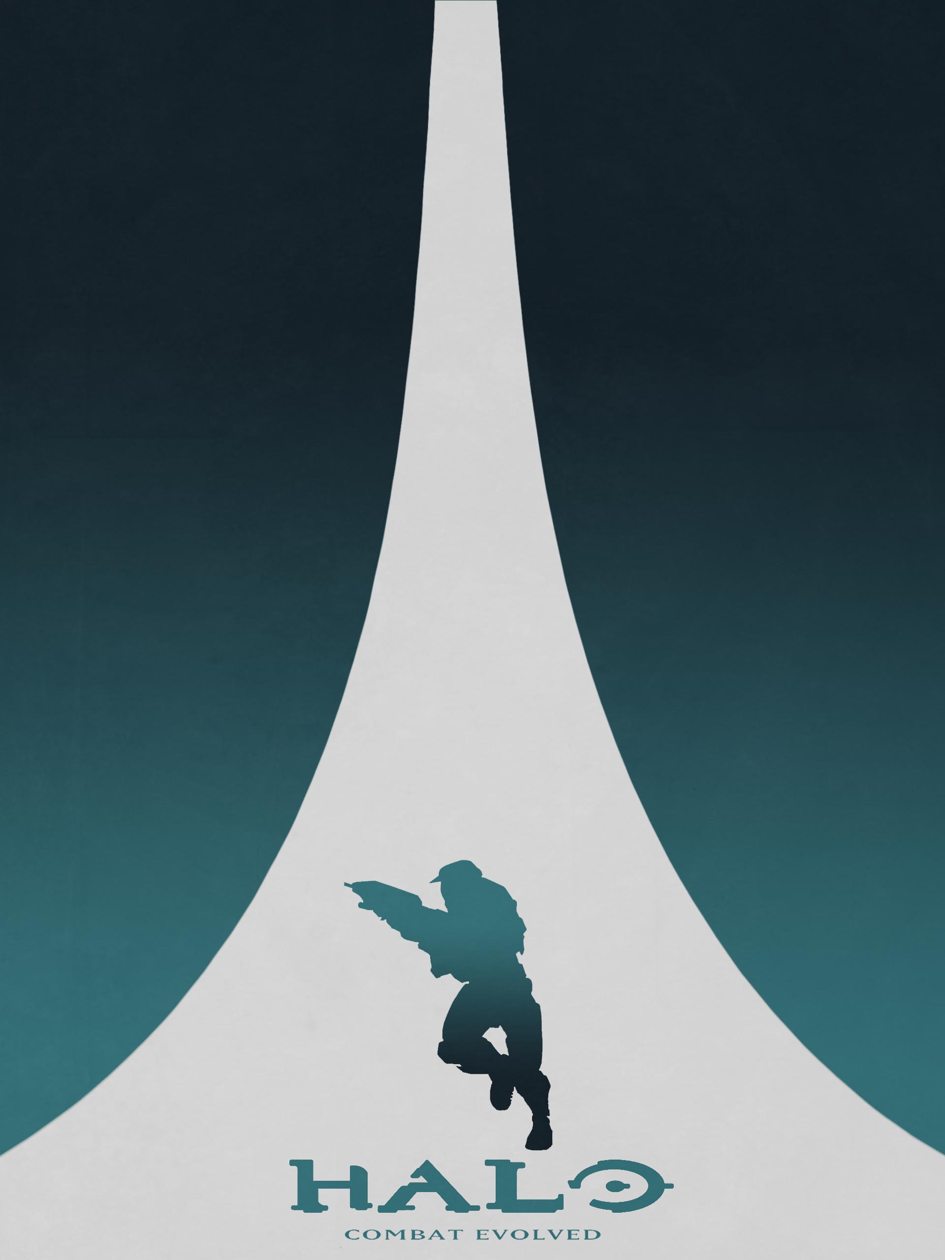
This one sums it up nicely. Chief and the Halo ring in perspective.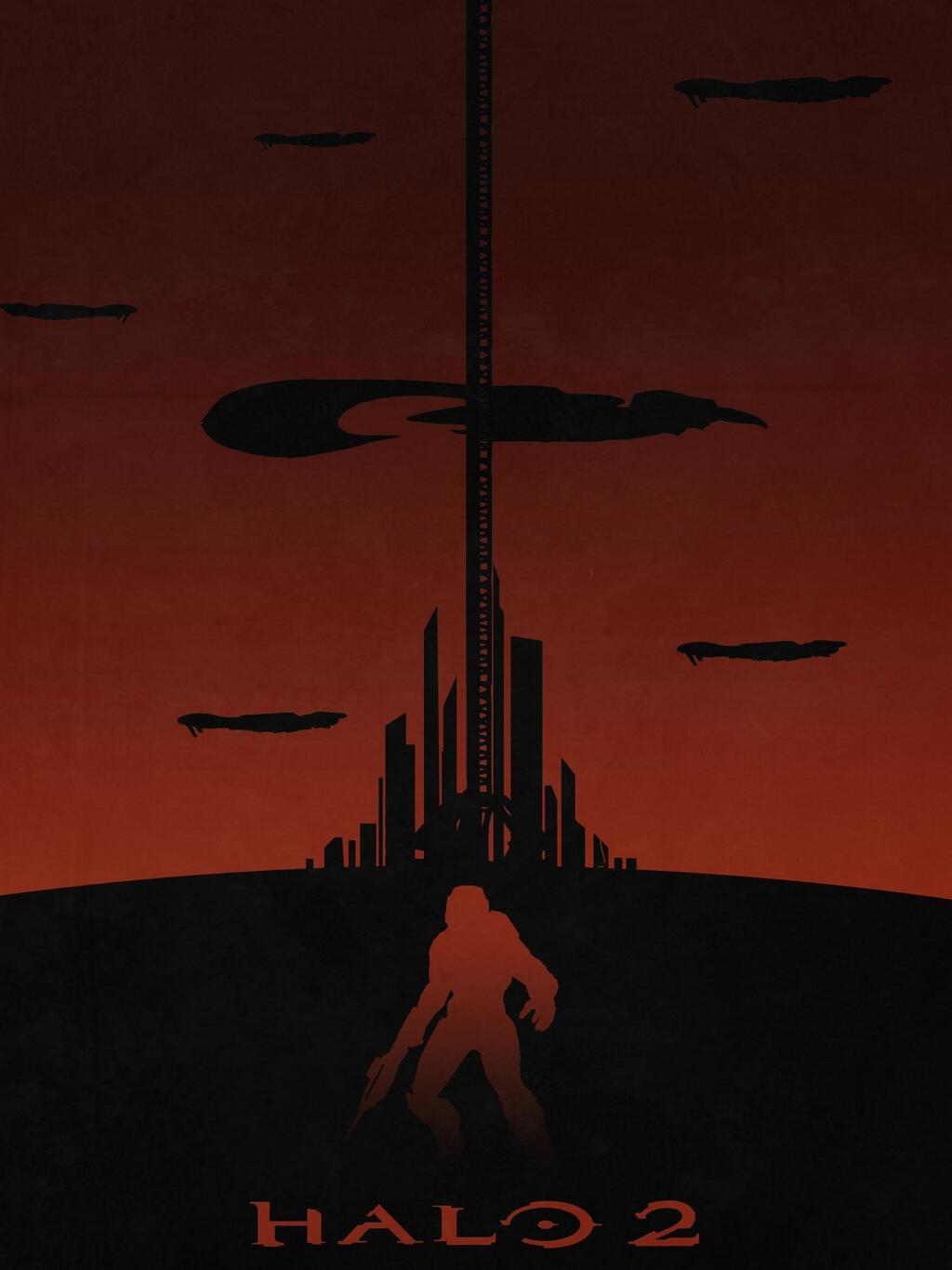
I really like this one. The city in the background with the immense space tether help to give it scale.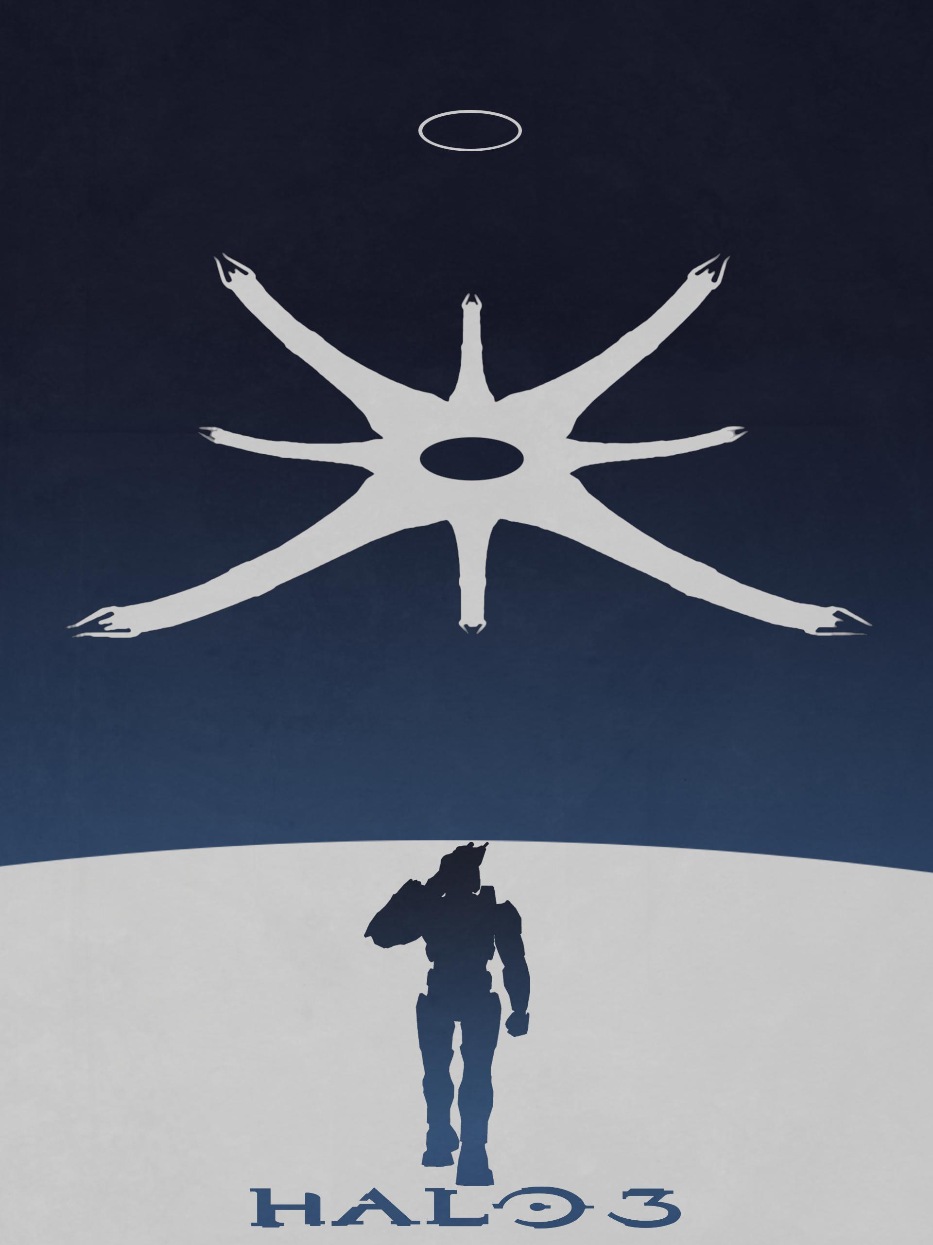
Ah the Ark! Classic pose for Chief too.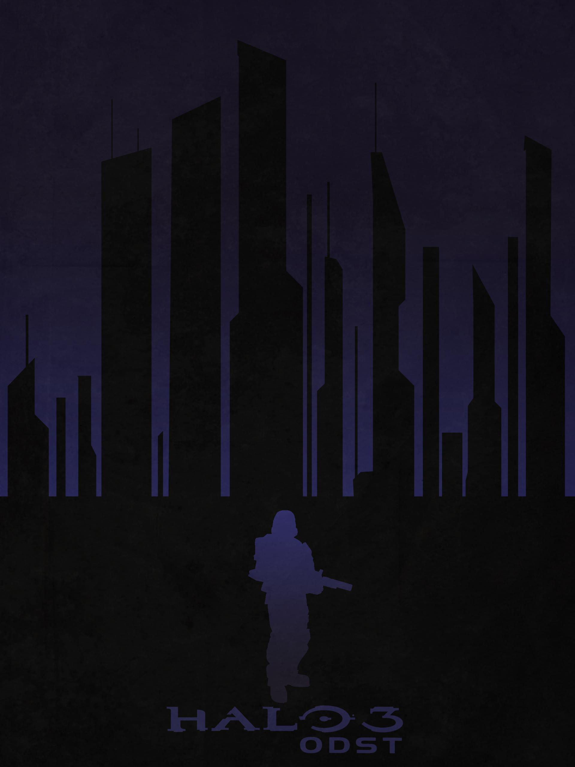
This one is pretty dark. But then again, the mood for much of the game WAS dark. Once again we visit New Mombasa, but this time in the poster it’s closer, more “intimate”. That also reflects the tone of this game. Kudos to the artist for capturing the game’s essence in this poster.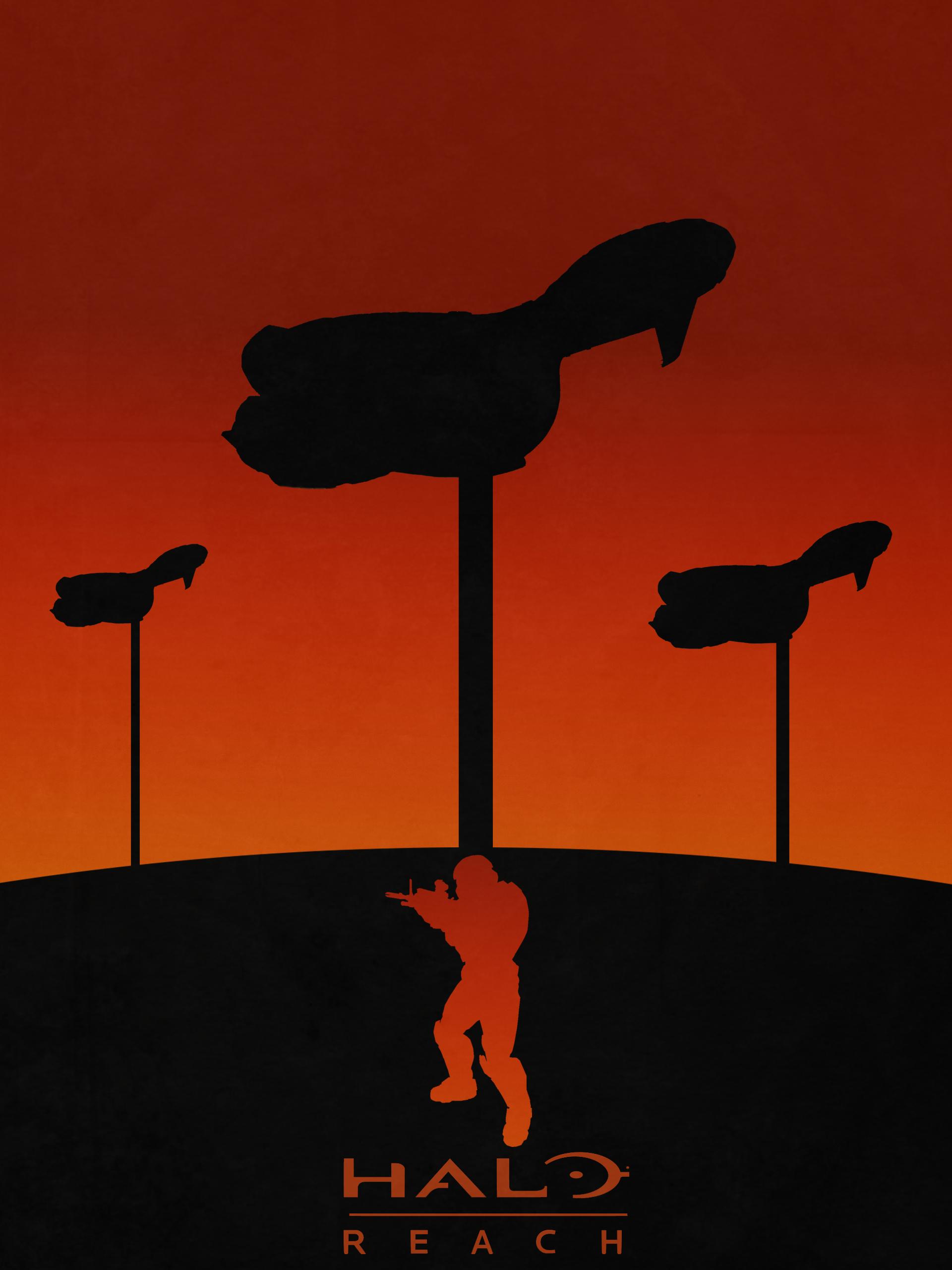
Poor Reach. Doesn’t ever seem to stopped being glassed. The look of this poster is very much like it’s more colorful official poster.
I’m wondering if the artist will also make posters for Halo CE Anniversary and Halo: Spartan Assault? I can only hope!
So do you like these? If so, which is your favorite? Click that reply button and let me hear you! (or rather read… 😛 )
-Sal