Well, after a quite busy Memorial Day, I’m finally able to post today’s concept art article. This one is focusing on several of the multiplayer maps in Halo 4.
So let’s take a tour of what the Infinity’s holodeck has in store for us in war game maps!
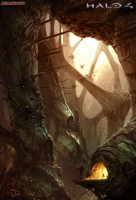
First up, Abandon.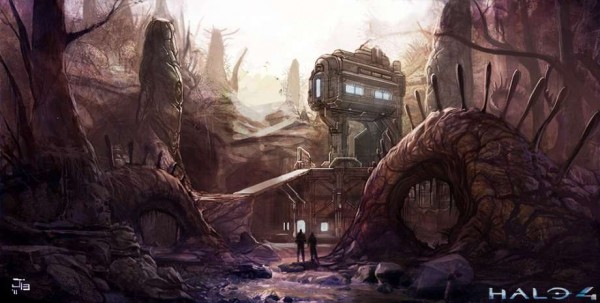
Abandon looked very different in early stages. While still much overgrowth, it didn’t have as much of a canopy to it nor was as dark. Some of those formations in the concept above are quite alien. The two curving ones with spike coming out of them look like an alien creature, more than rock or foliage.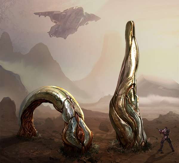
Above it seems those curving elements might have been carnivorous plants. Now THAT would have been something pretty unique. An interactive element that will try to kill you if you get too close.

Here we see Abandon with more of the canopy. Are those buggers in the sky? The lit alcove the Spartan is standing by look like Yoda’s hut from Star Wars. That would have been a nice nod to another sci-fii franchise.

Here we see Landfall in black and white. There are certainly similar elements to this design when compared with the final version.Here though, there is much less of the pier area. Well, at least from what we can see of it.
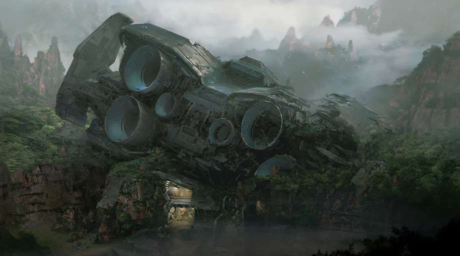
Let’s move on to Exile.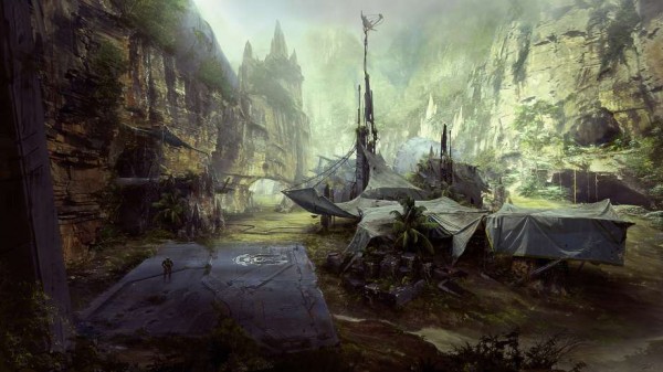
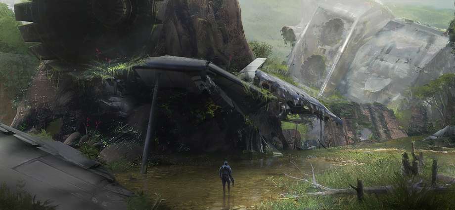
Exile is a colorful map. Between the grey remnants of the crashed ship, the browns of the dirt and rock and the plethora of greens for foliage, there is plenty to take in. This concept is a good reminder that you not only should have contrasting colors, as well as highlights and shadows, but textures as well.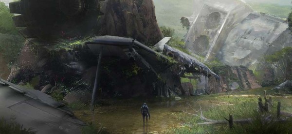
Normally metal textures within a natural setting might not blend so well. However, given that this is a crash site and the human survivors have made due with what they had left of the ship, I think they blend together nicely. In the final version, I do not feel that the ship parts overpower the natural elements, which is a good thing.
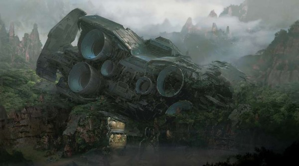
Here we see the bulk of the ship’s aft engine section. Beautiful in it’s tragedy. I wish this part of the map was able to be explored as well.
The last of the Exile concepts I have to show is from above. Here the rock outcroppings take on strange arching shapes. While arches do occur in nature, they are fairly rare and not so many in one place either. Those peaks seem very fragile.
This is no cave! (Or is it?)
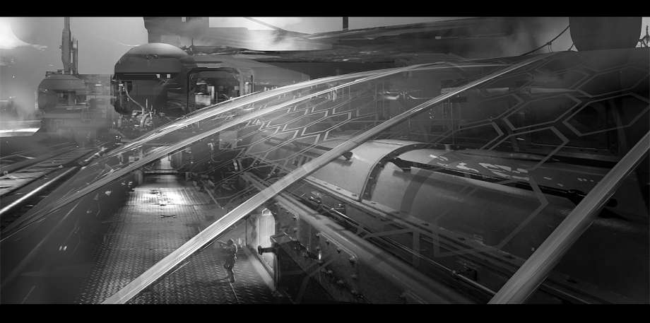
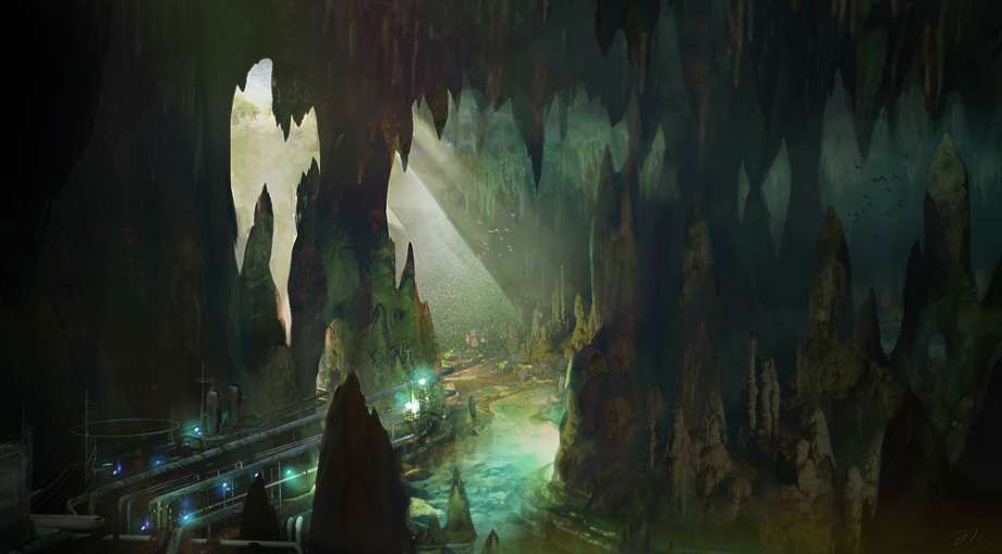
Erosion is a map with lots of potential for forging on. The concept above brings together browns and aquamarine colors to highlight that this isn’t just an ordinary cave, but extraordinary. The piping at bottom left helps with scale.
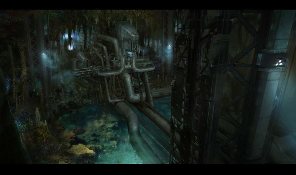
Now here we have a LOT of piping coming from some internal structure that we can not entirely see. I like the industrial feel of this concept and have to say that I’d MUCH more would have preferred this as the final map, so long as we could build at water’s edge. I imagine in this rendering that some of the map went into that back industrial area. One thing I like about this piece is how well the water was done. The rocks and pipes below the waterline look fantastic and believable.

The above concept is very close to the final version. The main different is that the building seems to go up and form a portion of the roof of the map. That’s one thing I’m glad didn’t happen. Did you know you CAN build on the roof of the building in Erosion? It’s an excellent space. Go check out the pieces built on top of it.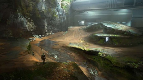
Another angle of nearly the same view, we see where water was to play a role in this map. Alas, that didn’t make the cut. While it wouldn’t have done much, it still would have been a nice aesthetic element. Perhaps it was cut due to time constraints?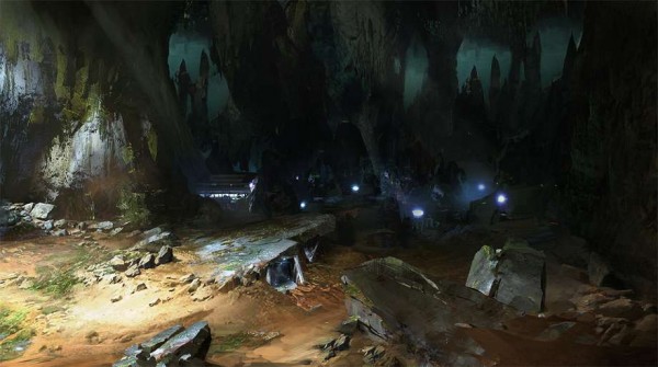
Here we see a highly contrasted Erosion. If only we had the ability in forge to add that many lights to our maps… It appears as if this concept doe not have the large open area beyond the lighter portion. Rather it seems more “flat” by design. Honestly, I’d have liked that too.
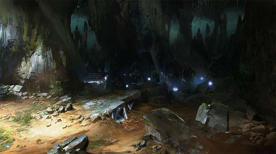
So much of Erosion is unusable as a realistic map. Those greenish stalactites in the distance are just that, in the distance. You can’t build near all of them. I hope 343 takes more of that into account for the next game. If you’re going to make a massive map, make most of it useable. Please.

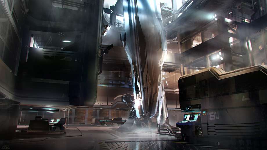
No, this isn’t the Composer you’re seeing. Though that is what many folks thought when they first saw this on Complex. It is surely Forerunner, though we do not know it’s use. This concept seems better than the map we got, well at least that portion of it. In the above, there are several floors, more aesthetic elements and such. In fact, this kind of reminds me of “Coutdown” from Reach. And that is perhaps why we didn’t get it as the final version.

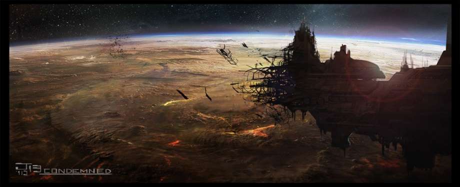
A very different looking Adrift. It seems we were to have more of a spaceship to play on that a simple platform. While I like Adrift, I hope we do get another derelict spaceship map in the next game. Hopefully one with a low gravity area on it too like Condemned from Halo Reach. Perhaps because this concept was named for the former, 343 decided to go a different direction from it. It’s a shame how many of the Bungie things are shunned by 343. where it not for Bungie, there would be no Halo.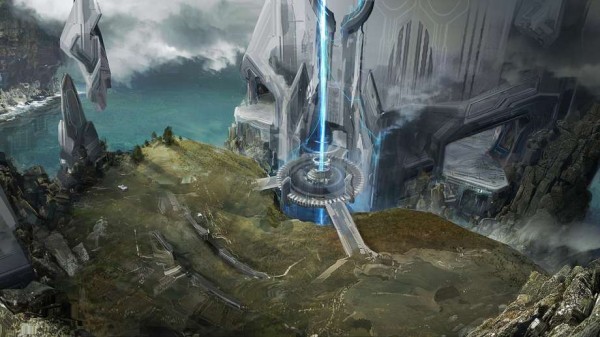
You may have seen this concept before.It’s Ravine. Much of the map looks similar to the final. Personally, I’d rather have this version with the central platform bridges and beam of light.
Here we see that the Forerunner half of the map was to be much more like a coliseum than the more trapezoidal shape we got. Again, I’d have preferred this instead. Heh, It’s really strange how much I prefer many of the concept versions over the actual maps we got in the game. One thing that really stands out above is the heavy blue light.
Ravine, though not at all how we know it by today. I like the far off ground structures here.
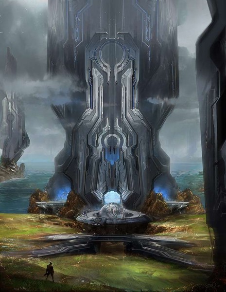
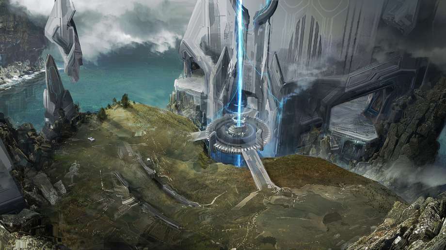
The above is a much more majestic form of Ravine. That Forerunner structure is MASSIVE. Again we have the central platform, now with a sphere included.The bridge in the foreground is more symmetrical than the similar structure of the final version. Yep…I’d have preferred this over the in-game one as well.
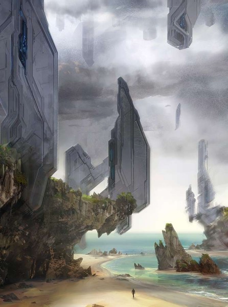
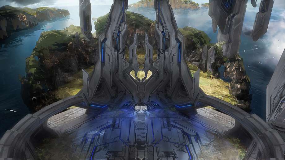
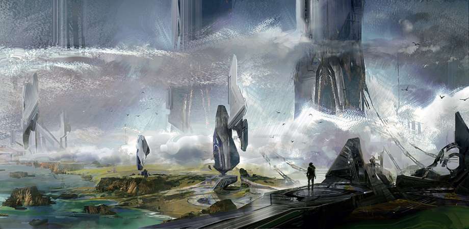
Now this version of Ravine is my favorite of the Ravine concepts. It reminds me both of Forge World from Halo Reach as well as a portion of Halo CE. I hope that 343 and/or Certain Affinity will create maps at water level with this kind of detail. Water seemed like a weak spot in Halo 4. The lone being walking the beach gives us the immense sense of scale that the Forerunner structures have to them.
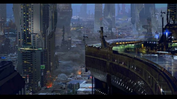 Finally, we have Skyline. A rare urban environment. This concept is nothing like the final version. With many large buildings in the background, a more wide open map (I’m assuming the right area is the playable area here), this concept shows the Skyline we could have got. Don’t get me wrong, I really like the in-game version. The Paris streets in the background of the map (yes, that is what they are), added to it’s realism. But this concept says “Skyline” more to me than the actual one does. I hope this concept is revisited for a potential map in Halo 5 Guardians.
We’ve still got 2 more parts of the Halo 4 Environmental Concept Art articles to go. Tune in tomorrow for Part 4 Forerunner Environments.
Did you like today’s concept art article? If so, what about it did you like? Have any favorites in this article? If so, what about it/them make it a favorite?
Reply below. You know I’m always curious to know what you folks think of these as well.
-Sal