
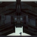
It’s 2:00 a.m. Pacific Daylight Time on Friday, March 16. HFFL: Sorry for the interruption, Bravo. It was May, not March. Okay, carry on. After about an hour of sleep, my alarm goes off, but for the first time in weeks, and possibly months, I don’t hit the snooze button. Instead, I jump out of bed, throw a hoodie on, grab my backpack and keys, and I’m out the door. After a quick, foggy-eyed drive down the road, I swipe my badge at the door, and find a (mostly empty) studio, with a few fellow members of the Community team already at their desks. It was time to announce the title of the next installment in the legendary saga of the Master Chief, Halo 5: Guardians.
Last week’s announcement was, as Frankie said, a big weight off of our shoulders. For nearly a year, you’ve been wanting to know more about the future of Halo on Xbox One, and being able to finally announce this title, along with releasing some visuals, was exciting to say the least. Seeing the immediate response, analysis of the visuals and name itself, as well as all of the new discussions that emerged was overwhelming. We were thrilled to join in on the long-awaited excitement and conversation for the first time since last year. We’ll be able (and can’t wait) to share details about what’s coming for the Halo franchise in 2014 in just a few short weeks at E3.
HFFL: Hopefully, 343 will address the leak by the supposed insider. Either refuting it, confirming parts of it, just please do not completely IGNORE it…
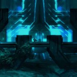
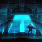
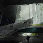
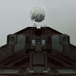
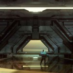
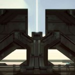
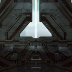
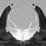
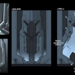
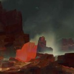
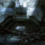
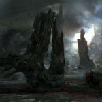
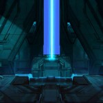
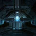
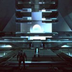
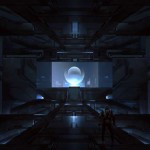
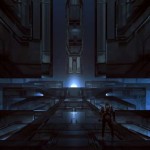
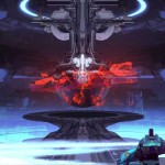
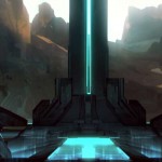
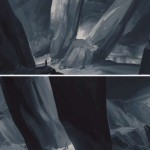
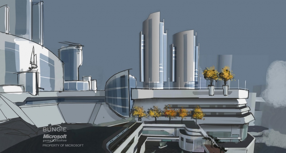
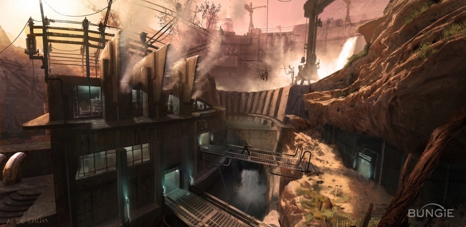
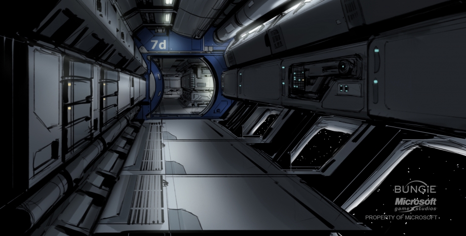
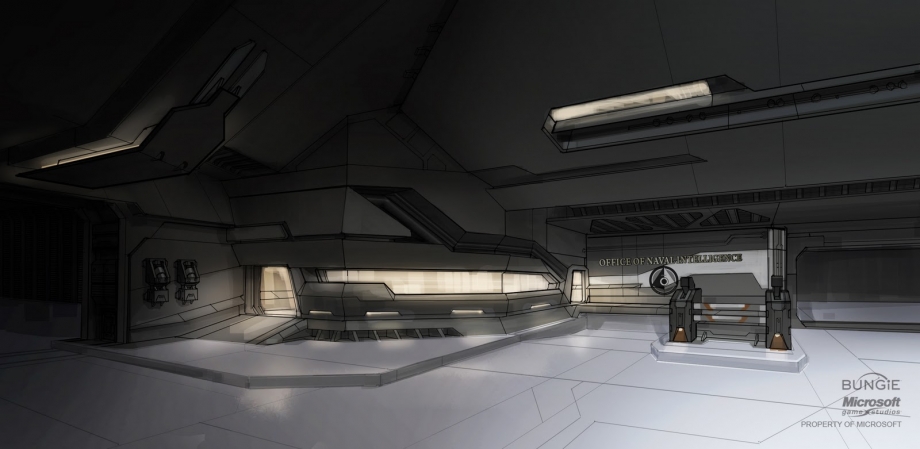
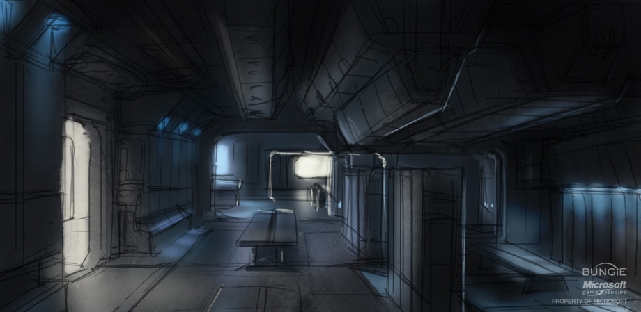
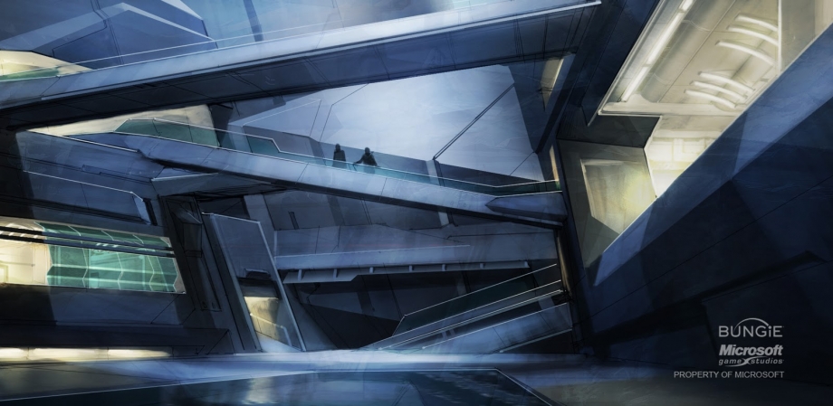
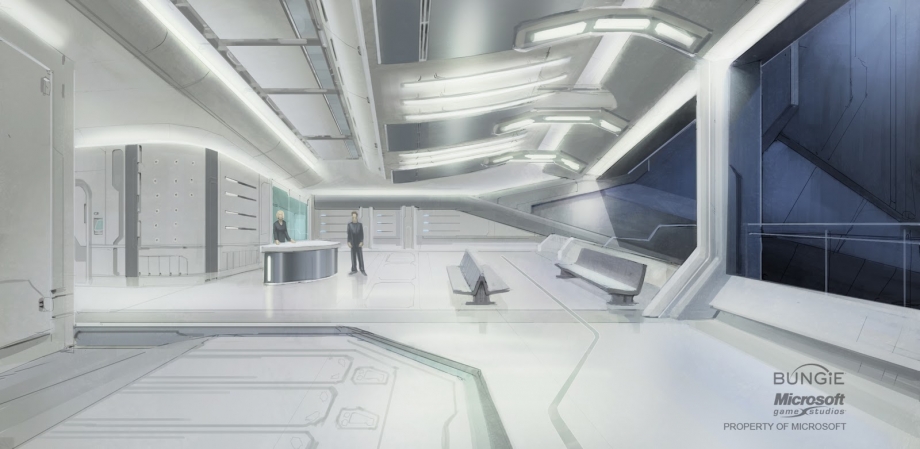
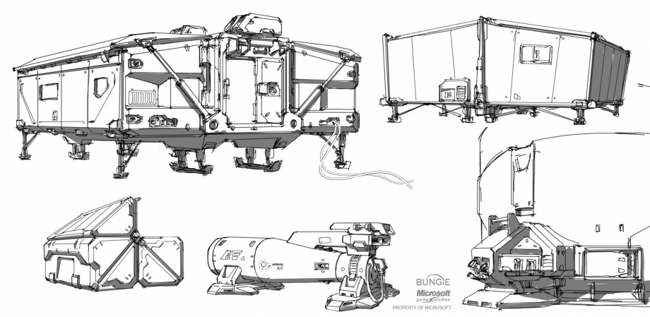
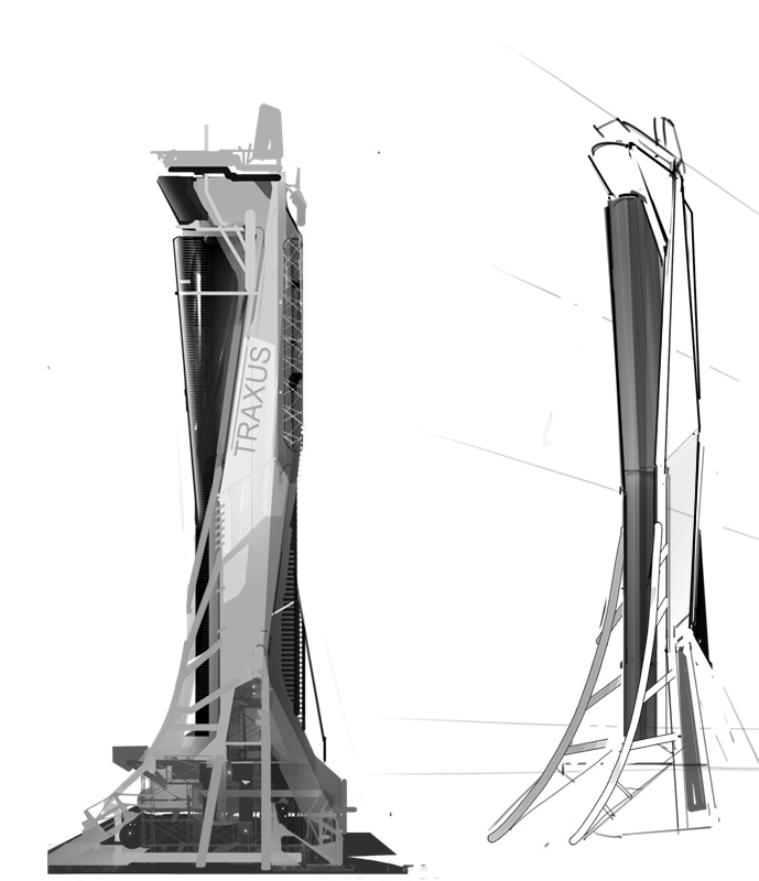
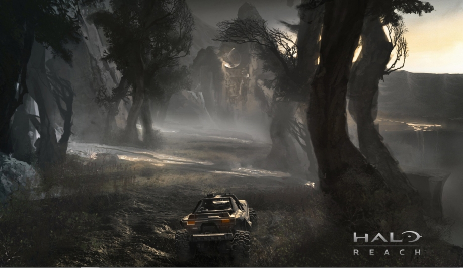
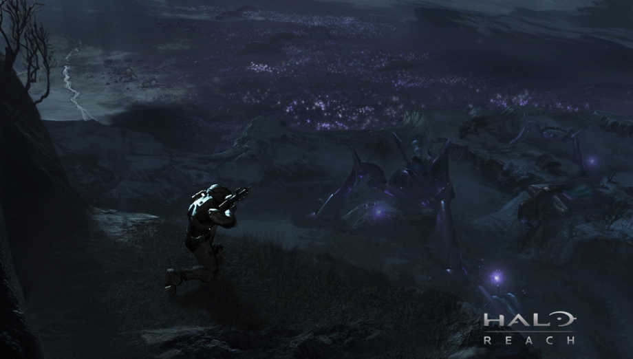
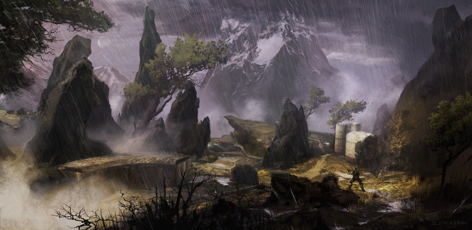
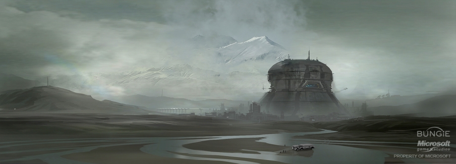
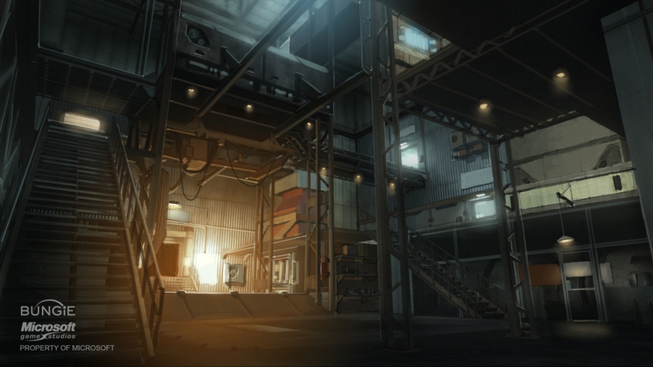
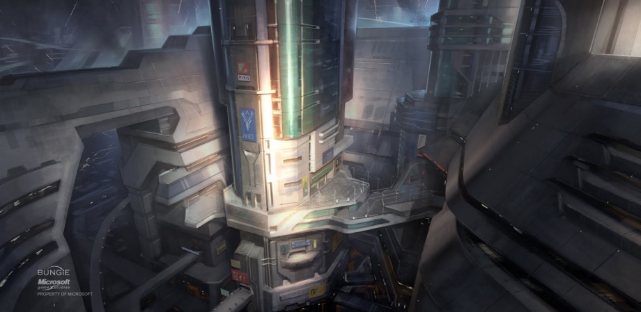
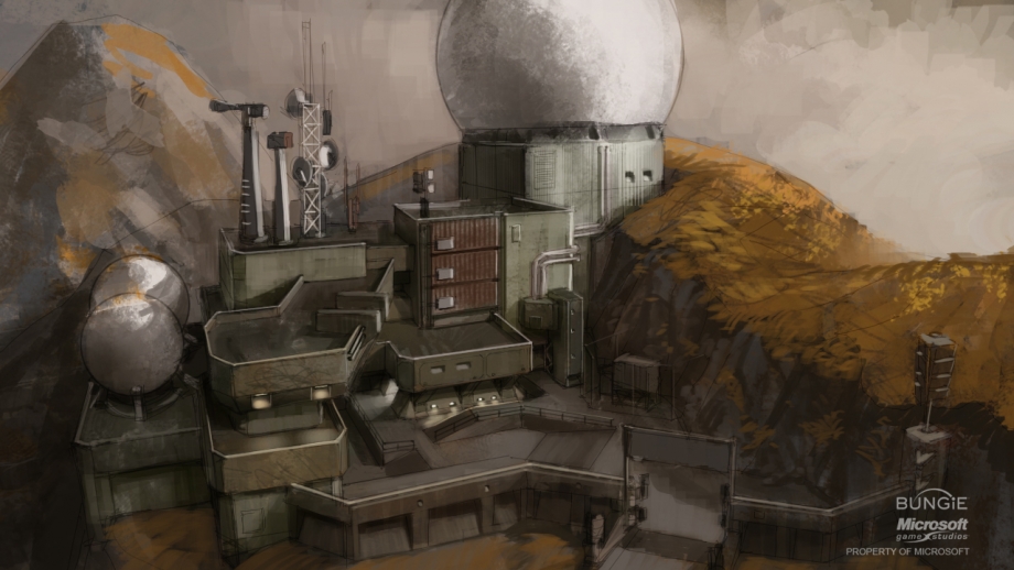
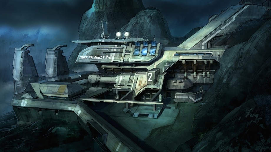
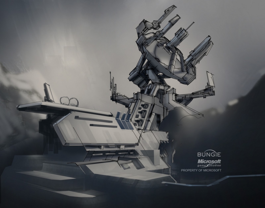
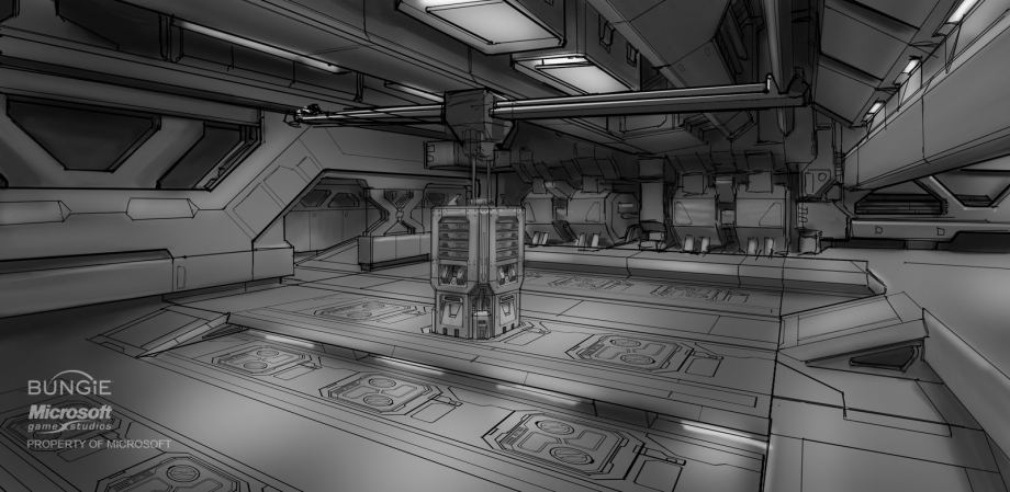
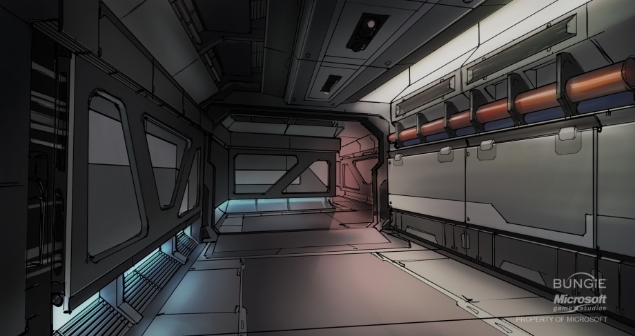
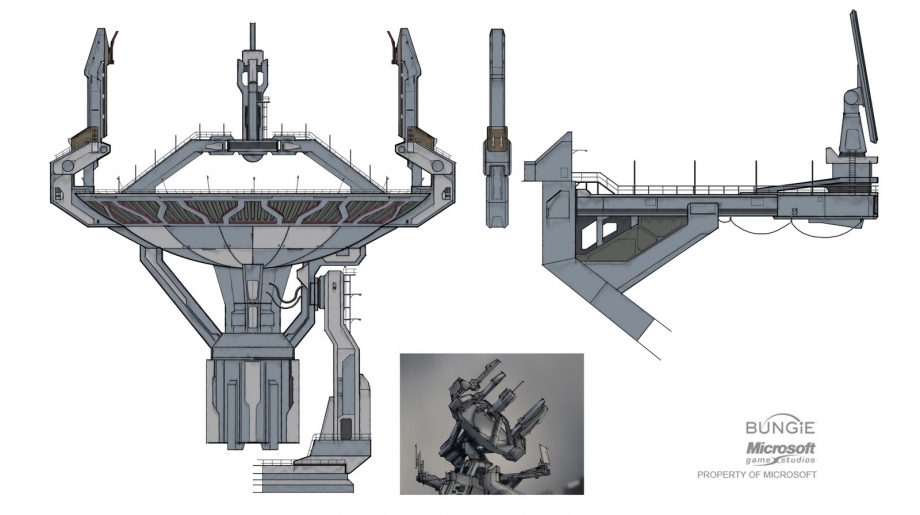
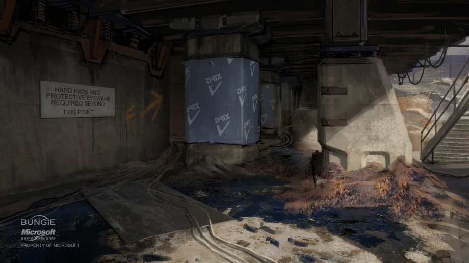
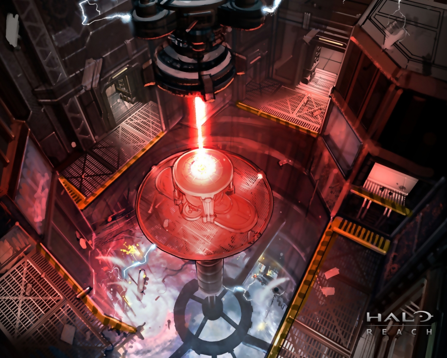
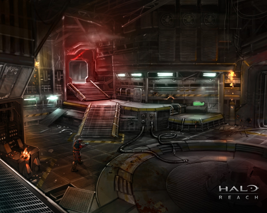
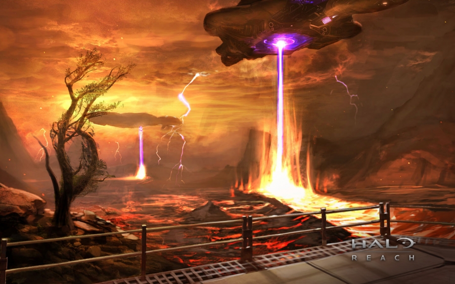
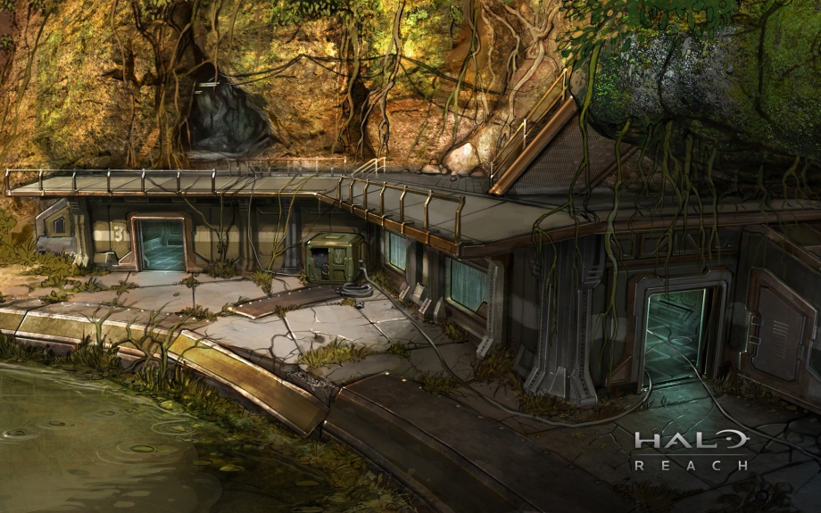
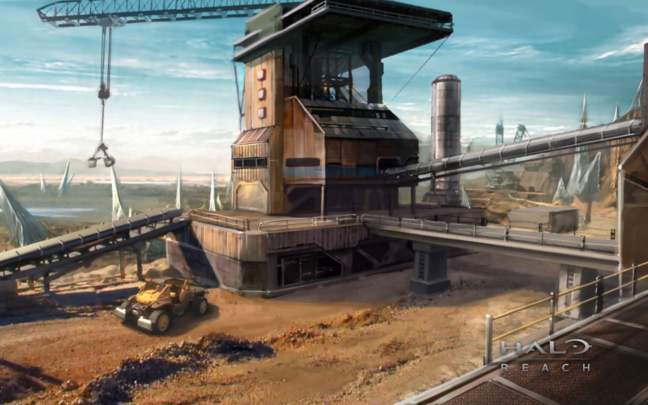
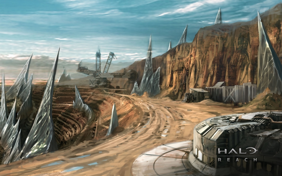
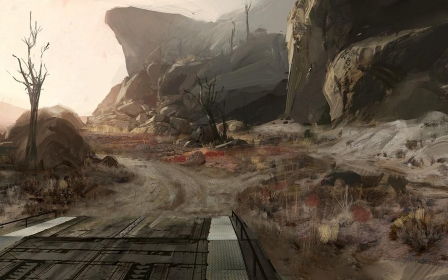
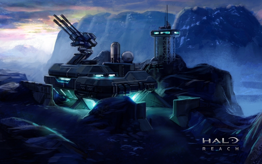
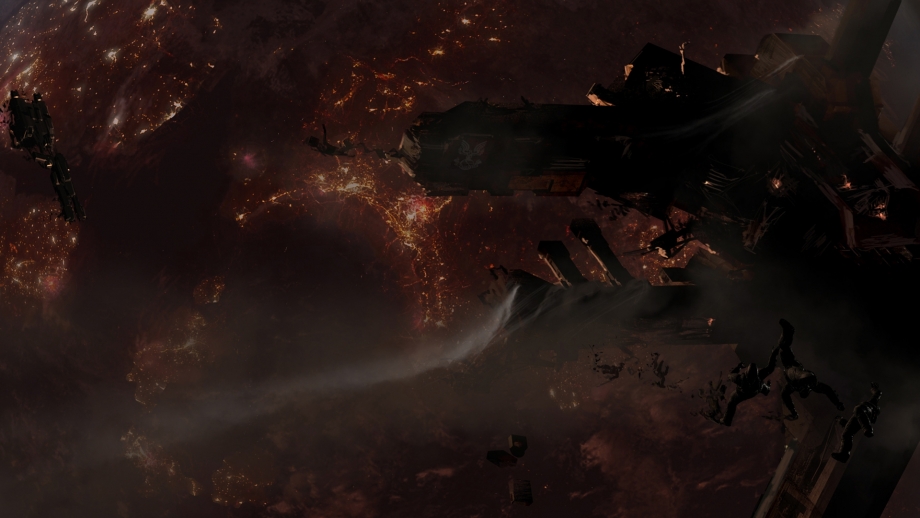
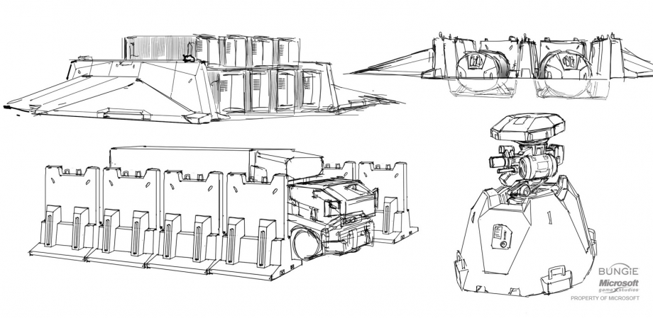
Last week, we released some exclusive Halo 5: Guardians wallpapers (you can snag ‘em here), and today, due to requests from you, the community, we prepared wallpapers of Friday’s concept art from our very own Sparth. Download below, and beautify your screens.
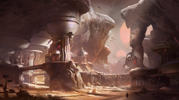
Desktop – 1024×768, 1280×720, 1920×1080
Windows Phone – Surface – Android – Android Tablet – iPhone 5 – iPad – iPad Mini – iPad 2
Next up, we’ve got some Matchmaking goodies as well as community creations. Let’s dig in!
Matchmaking Playlist Update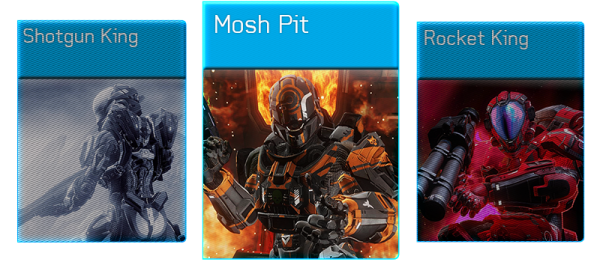
Last week, we sat down and brainstormed about which King of the Hill game types we could include in the Community Choice Poll. During a quick run down memory lane (which is fairly common for a Community Choice Poll brainstorm), we stopped at Halo 3’s Mosh Pit, and immediately knew that it had to be included for community consideration. Apparently you did as well, as the game type earned nearly 80% of your votes, and will be included in the King of the Hill playlist this coming Monday. Once you’re done BBQ’ing with the family, jump into the Mosh Pit. Actually, it may be best to wait 30 minutes after eating before doing so.
Additionally, we’ll be adding Stealth King to the playlist. The game type is quite different from traditional King of the Hill – each player is equipped with a Sniper Rifle, Plasma Grenades, and the Thruster Pack. Oh, and all players in the Hill have Active Camouflage. If it sounds crazy, it absolutely is, and we hope you enjoy this new fun game type during King of the Hill’s reign as our featured playlist.
HFFL: A variant of Stealth King was playable in Halo Reach. I’m definitely looking forward to playing that game type.
We’ve also added several new game types to other playlists – included in this list is the following:
- Added Oddball to Team Doubles
- Added Neutral Flag to Team Doubles
- Added Neutral Flag to Team Heavies
To enjoy these new experiences in Halo 4 Matchmaking, jump in and try ‘em out!
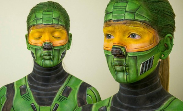
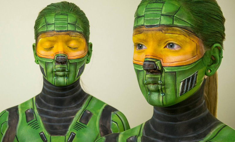
The Master of Master Chief Makeup
We don’t often get the chance to talk about makeup on The Bulletin, so we were excited to see Elsa Rhae’s absolutely incredible makeup and face painting skills highlighted on thechive.com. Elsa is in a category several steps above that guy who can slap a set of kitten whiskers on your little sister at the county art fair. Of course, we’re particularly impressed by her Master Chief face paint, but you should check out the rest of her impressive breadth of work at her Facebook and Instagram or even take a master class from her, courtesy of her YouTube channel.
Community Spotlight Shines Again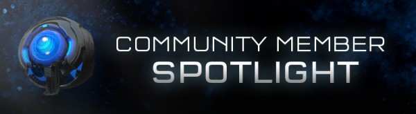
The acclaimed and mysterious author of our Community Spotlight recently returned from their sabbatical. The weeks spent on a moisture farm near Tashi Station have treated him them well and the series returned this week with renewed spirit!
This week, learn all about Mastrbiggy from HBO’s news team and look forward to future installments of this bi-weekly series.
HFFL: Just once, I’d love to see a fan spotlighted who ISN’T from one of the huge sites. No offense to any of those sites. However, they have well more than enough publicity and members. I wish 343 would take a page from Bungie when Bungie used to spotlight small sites/groups/etc. Some of those sites are just as dedicated to Halo, even if they aren’t as big/popular/as well staffed/etc. I can think a several I’d like to see be spotlighted who I think are deserving of it, given their passion and dedication to Halo. (And no, I do not mean me, though it of course would be an honor.)
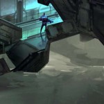
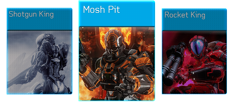
Screenshot Spotlight: Shotgun
Last week, we turned the spotlight on the Sticky Detonator. Take a gander at the following Shotgun screenshots, and maybe even find inspiration to make your own.
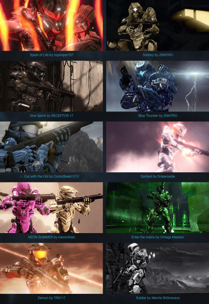
HFFL: From this gallery I like the following: “Spark of Life” and “Enter the matrix”.
For your chance at being in the next spotlight, take a screenshot from a King of the Hill match and then tag it with “KotH” and “Halo Waypoint,” and maybe, just maybe, yours will be featured in the next Halo Bulletin!
And with that, this week’s Bulletin comes to a close.
Until next week,
Bravo
HFFL: Is it me or are the bulletins a bit sparse of late? Hopefully they are saving up for E3 in just a few short (LONG) weeks….
-Sal


